R for Plotting
Overview
Teaching: 90 min
Exercises: 30 minQuestions
How do I read data into R?
What are geometries and aesthetics?
How can I use R to create and save professional data visualizations?
Objectives
To be able to read in data from csv files.
To create plots with both discrete and continuous variables.
To understand mapping and layering using
ggplot2.To be able to modify a plot’s color, theme, and axis labels.
To be able to save plots to a local directory.
Contents
- The “goal” of the workshop
- Overview of the lesson
- Directory structure
- Loading and reviewing data
- Our first plot
- Plotting for data exploration
- Applying it to your own data
- Glossary of terms
The “goal” of the workshop
Our goal is to write a report to the United Nations on the relationship between lung cancer, smoking, and air pollution. In other words, we are going to analyze how countries’ smoking rates and air pollution may be related to the percent of people with lung cancer.
To get to that point, we’ll need to learn how to manage data, make plots, and generate reports. The next section discusses in more detail exactly what we will cover.
Overview of the lesson
In this lesson, we will go over how to read tabular data into R (e.g. from a csv file) and plot it for exploratory data analysis.
Exercise: Create a new R Script file
We would like to create a file where we can keep track of our R code. On your own, create a file called
plotting.Rin the project directory.Solution
Navigate to the “File” menu in RStudio. You’ll see the first option is “New File.” Selecting “New File” opens another menu to the right, and the first option is “R Script.” Select “R script.” Alternatively, you can click on the white square button with a green plus sign in the upper left corner and select “R Script.”
Now you have an untitled R Script in your Editor tab. Save this file as
plotting.Rin our project directory.
Directory structure
Exercise: File organization
- When you’re working on a project, how do you organize your files?
- Take a look at your
un-reportdirectory. You should be able to see it in the bottom right side of your screen under the “Files” tab. What folders are there, and why do you think they’re there?Solution
There are lots of different ways to organize files, but you should have some consistent method of organizing them so that it’s easy to find what you want. If you have all of your files in one folder, it can get kind of confusing to find what you need. In the
un-reportdirectory there are three “sub-directories”:data,figures, andreports.
datacontains all of the data that we will need for the workshop.figuresis where we will save the figures we generate during the workshop.reportsis where we will save our final report.
Loading and reviewing data
The tidyverse vs Base R
If you’ve used R before, you may have learned commands that are different than the ones we will be using during this workshop. We will be focusing on functions from the tidyverse. The “tidyverse” is a collection of R packages that have been designed to work well together and offer many convenient features that do not come with a fresh install of R (aka “base R”). These packages are very popular and have a lot of developer support including many staff members from RStudio. These functions generally help you to write code that is easier to read and maintain. We believe learning these tools will help you become more productive more quickly.
First, we’re going to load the tidyverse package. Packages are useful because they contain pre-made functions to do specific tasks. Tidyverse contains a set of functions that makes it easier for us to do complex analyses and create professional visualizations in R. The way we access all of these useful functions is by running the following command:
library(tidyverse)
Warning: package 'ggplot2' was built under R version 4.3.3
Warning: package 'tibble' was built under R version 4.3.3
Warning: package 'purrr' was built under R version 4.3.3
Warning: package 'lubridate' was built under R version 4.3.3
── Attaching core tidyverse packages ──────────────────────── tidyverse 2.0.0 ──
✔ dplyr     1.1.4     ✔ readr     2.1.5
✔ forcats   1.0.0     ✔ stringr   1.5.1
✔ ggplot2   3.5.2     ✔ tibble    3.3.0
✔ lubridate 1.9.4     ✔ tidyr     1.3.1
✔ purrr     1.0.4
── Conflicts ────────────────────────────────────────── tidyverse_conflicts() ──
✖ dplyr::filter() masks stats::filter()
✖ dplyr::lag()    masks stats::lag()
ℹ Use the conflicted package (<http://conflicted.r-lib.org/>) to force all conflicts to become errors
When you loaded the tidyverse package, you probably got a message like the one we got above. This isn’t an error! These messages are just giving you more information about what happened when you loaded tidyverse. For now, we don’t have to worry about the messages. You can read the bonus section below for more details.
Bonus: What’s with all those messages???
The tidyverse messages give you more information about what happened when you loaded
tidyverse. Thetidyverseis actually a collection of several different packages, so the first section of the message tells us what packages were installed when we loadedtidyverse(these includeggplot2, which we’ll be using a lot in this lesson, anddyplr, which you’ll be introduced to tomorrow in the R for Data Analysis lesson).The second section of messages gives a list of “conflicts.” Sometimes, the same function name will be used in two different packages, and R has to decide which function to use. For example, our message says that:
dplyr::filter() masks stats::filter()This means that two different packages (
dyplrfromtidyverseandstatsfrom base R) have a function namedfilter(). By default, R uses the function that was most recently loaded, so if we try using thefilter()function after loadingtidyverse, we will be using thefilter()function fromdplyr().
Okay, now let’s read in our data, smoking_cancer_1990.csv.
To do this, we need to know the file path, which tells R where to find the file on your computer.
When you have a project open in R, it starts looking from your main project folder, in our case un-report.
Inside un-report, we have a folder called data, and in that folder is the smoking_cancer_1990.csv file.
This is the file that contains the data that we want to plot.
So the file path from our main project directory is: data/smoking_cancer_1990.csv.
The / tells R that the file is in the data directory.
We’re going to use the read_csv() function that we loaded in with the tidyverse,
and save it to smoking_1990, which will act as a placeholder for our data.
This function takes a file path and returns a tibble, which is basically a table (that we sometimes call a data frame…).
smoking_1990 <- read_csv("data/smoking_cancer_1990.csv")
Rows: 191 Columns: 6
── Column specification ────────────────────────────────────────────────────────
Delimiter: ","
chr (2): country, continent
dbl (4): year, pop, smoke_pct, lung_cancer_pct

ℹ Use `spec()` to retrieve the full column specification for this data.
ℹ Specify the column types or set `show_col_types = FALSE` to quiet this message.
A few things printed out to the screen: it tells us how many rows and columns are in our data, and information about each of the columns. Each row contains the continent (“continent”), the total population (“pop”), the age-standardized percent of people who smoke (“smoke_pct”), and the age-standardized percent of people who have lung cancer (“lung_cancer_pct”) for a given country (“country”). We can see that two of the columns are characters (categorical variables), and three are doubles (numbers).
Bonus: Characters vs. factors
Note: In anything before R 4.0, categorical variables used to be read in as factors, which are special data objects that are used to store categorical data and have limited numbers of unique values. The unique values of a factor are tracked via the “levels” of a factor. A factor will always remember all of its levels even if the values don’t actually appear in your data. The factor will also remember the order of the levels and will always print values out in the same order (by default this order is alphabetical).
If your columns are stored as character values but you need factors for plotting, ggplot will convert them to factors for you as needed.
Now let’s look at the data a bit more.
In the Environment tab in the upper right corner of RStudio, you will now see smoking_1990 listed.
If you click on it, it will pop up in a tab next to your script.
After we’ve reviewed the data, you’ll want to make sure to click the tab in the upper left to return to your plotting.R file so we can start writing some code.
Another way to look at the data is to print it out to the console:
smoking_1990
# A tibble: 191 × 6
    year country             continent          pop smoke_pct lung_cancer_pct
   <dbl> <chr>               <chr>            <dbl>     <dbl>           <dbl>
 1  1990 Afghanistan         Asia          12412311      3.12          0.0127
 2  1990 Albania             Europe         3286542     24.2           0.0327
 3  1990 Algeria             Africa        25758872     18.9           0.0118
 4  1990 Andorra             Europe           54508     36.6           0.0609
 5  1990 Angola              Africa        11848385     12.5           0.0139
 6  1990 Antigua and Barbuda North America    62533      6.80          0.0105
 7  1990 Argentina           South America 32618648     30.4           0.0344
 8  1990 Armenia             Europe         3538164     30.5           0.0441
 9  1990 Australia           Oceania       17065100     29.3           0.0599
10  1990 Austria             Europe         7677850     35.4           0.0439
# ℹ 181 more rows
The read_csv() function took the file path we provided, did who-knows-what behind the scenes, and then outputted an R object with the data stored in that csv file. All that, with one short line of code!
Data objects
There are many different ways to store data in R. Most objects have a table-like structure with rows and columns. We will refer to these objects generally as “data objects”. If you’ve used R before, you many be used to calling them “data frames”. Functions from the
tidyversesuch asread_csv()work with objects called “tibbles”, which are a specialized kind of “data frame.” Another common way to store data is a “data table”. All of these types of data objects (tibbles, data frames, and data tables) can be used with the commands we will learn in this lesson to make plots. We may sometimes use these terms interchangeably.
Bonus Exercise: Reading in an excel file
Say you have an excel file and not a csv - how would you read that in? Hint: Use the Internet to help you figure it out!
Solution
One way is using the
read_excelfunction in thereadxlpackage. Hint: you may need to useinstall.packages()to install thereadxlpackage. There are other ways to read in excel files, but this is our preferred method because the output will be the same as the output ofread_csv.
Our first plot
Creating our first plot
We will be using the ggplot2 package, which is part of the tidyverse, to make our plots. This is a very
powerful package that creates professional looking plots and is one of the
reasons people like using R so much.
When making a plot, you first have to come up with a question you wish to answer related to your data. Here, we are interested in whether there is a relationship between the percent of people who smoke and the percent of people with lung cancer.
What do we want to plot?
Given that we are interested in whether there is a relationship between the percent of people who smoke and the percent of people with lung cancer:
- What variables would you want to put on the x and y axes?
- What columns do those variables correspond to in our
smoking_1990dataset?- What type of plot would you want to make?
Hint: take a look at this blog post if you need ideas about which plot type might be good.
Solution
A scatter plot with percent of people who smoke (
smoke_pctcolumn in our data) on the x axis and percent of people with lung cancer (lung_cancer_pctcolumn in our data) on the y axis will allow you to visualize the correlation between these two variables.
Now that we’ve figured out what we want to plot and what columns in our dataset we need to use, let’s get started!
All plots made using the ggplot2 package start by calling the ggplot() function.
In the tab you created for the plotting.R file, type the following:
ggplot(data=smoking_1990)

To run code that you’ve typed in the editor, you have a few options. Remember that the quickest way to run the code is by pressing Ctrl+Enter on your keyboard. This will run the line of code that currently contains your cursor or any highlighted code.
When we run this code, the Plots tab will pop to the front in the lower right corner of the RStudio screen. Right now, we just see a big grey rectangle.
What we’ve done is created a ggplot object and told it we will be using the data
from the smoking_1990 object that we’ve loaded into R. We’ve done this by
calling the ggplot() function with smoking_1990 as the data argument.
So we’ve made a plot object, now we need to start telling it what we actually want to draw on this plot.
The elements of a plot have a bunch of properties
like an x and y position, a size, a color, etc. When creating a data visualization,
we can map variables in our dataset to these properties, called aesthetics, in our plot.
In ggplot, we can do this by creating an “aesthetic mapping”, which we do with the
aes() function.
To create our plot, we need to map variables from our smoking_1990 object to
ggplot aesthetics using the aes() function. Since we have already told
ggplot that we are using the data in the smoking_1990 object, we can
access the columns of smoking_1990 using the object’s column names.
(Remember, R is case-sensitive, so we have to be careful to match the column
names exactly!)
Let’s start by telling our plot object that we want to map our smoking values to the x axis of our plot.
We do this by adding (+) information to
our plot object. Add this new line to your code and run both lines by
highlighting them and pressing Ctrl+Enter on your
keyboard:
ggplot(data = smoking_1990) +
  aes(x = smoke_pct)
Note that we’ve added this new function call to a second line just to make it
easier to read. To do this we make sure that the + is at the end of the first
line otherwise R will assume your command ends when it starts the next row. The
+ sign indicates not only that we are adding information, but to continue on
to the next line of code.
Observe that our Plot window is no longer a grey square. We now see that
we’ve mapped the smoke_pct column to the x axis of our plot. Note that that
column name isn’t very pretty as an x-axis label, so let’s add the labs()
function to make a nicer label for the x axis:
ggplot(data = smoking_1990) +
  aes(x = smoke_pct) +
  labs(x = "Percent of people who smoke")
Quotes vs. No Quotes (refresher)
Notice that when we added the label value we did so by placing the values inside quotes. This is because we are not using a value from inside our data object - we are providing the name directly. When you need to include actual text values in R, they will be placed inside quotes to tell them apart from other object or variable names.
The general rule is that if you want to use values from the columns of your data object, then you supply the name of the column without quotes, but if you want to specify a value that does not come from your data, then use quotes.
Mapping lung cancer rates to the y axis
Map our
lung_cancer_pctvalues to the y axis and give them a nice label.Solution
ggplot(data = smoking_1990) +
  aes(x = smoke_pct) +
  labs(x = "Percent of people who smoke") +
  aes(y = lung_cancer_pct) +
  labs(y = "Percent of people with lung cancer")
Excellent. We’ve now told our plot object where the x and y values are coming
from and what they stand for. But we haven’t told our object how we want it to
draw the data. There are many different plot types (bar charts, scatter plots,
histograms, etc). We tell our plot object what to draw by adding a geometry
(“geom” for short) to our object. We will talk about many different geometries
today, but for our first plot, let’s draw our data using the “points” geometry
for each value in the data set. To do this, we add geom_point() to our plot
object:
ggplot(data = smoking_1990) +
  aes(x = smoke_pct) +
  labs(x = "Percent of people who smoke") +
  aes(y = lung_cancer_pct) +
  labs(y = "Percent of people with lung cancer") +
  geom_point()
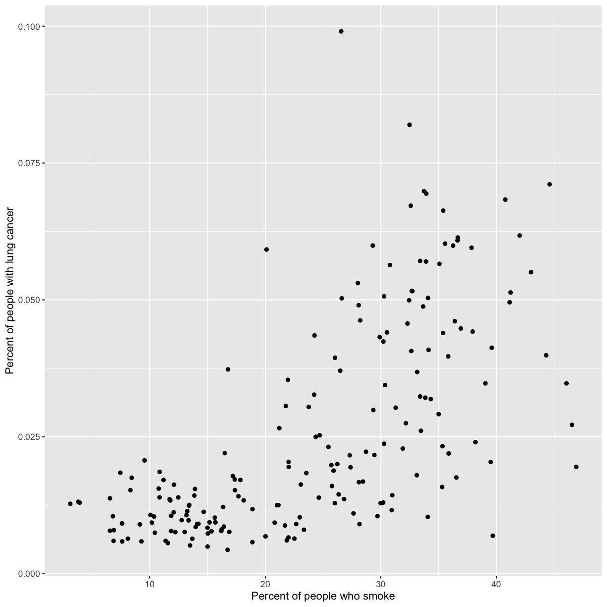
Now we’re really getting somewhere. It finally looks like a proper plot! We can now see a trend in the data. It looks like countries with greater smoking rates tend to have higher lung cancer rates, though it’s important to remember that we can’t infer causality from this plot alone.
Let’s add a title to our plot to make that clearer.
Again, we will use the labs() function, but this time we will use the title = argument.
ggplot(data = smoking_1990) +
  aes(x = smoke_pct) +
  labs(x = "Percent of people who smoke") +
  aes(y = lung_cancer_pct) +
  labs(y = "Percent of people with lung cancer") +
  geom_point() +
  labs(title = "Are lung cancer rates associated with smoking rates?")
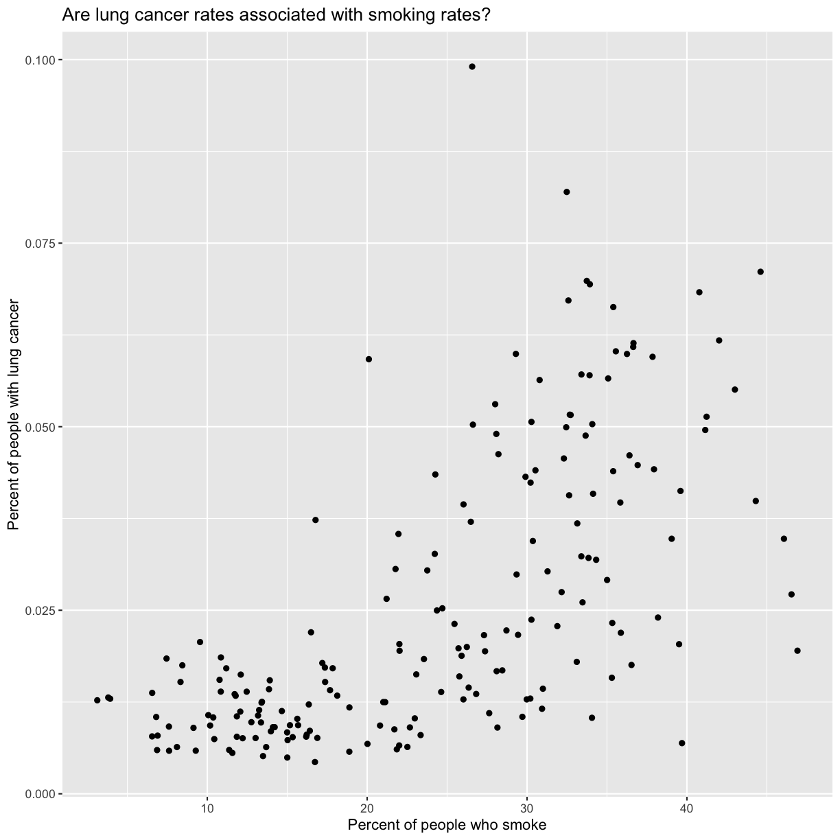
No one can deny we’ve made a very handsome plot!
We can immediately see that there is a positive association between lung cancer rates and smoking rates.
But now looking at the data, we might be curious about learning more about the points that are the extremes of
the data. We know that we have two more pieces of data in the smoking_1990
object that we haven’t used yet. Maybe we are curious if the different
continents show different patterns in smoking rates and lung cancer rates. One thing we
could do is use a different color for each of the continents. To map the
continent of each point to a color, we will again use the aes() function.
Color the points by continent
To color the points by continent, you will need to add that to your aesthetic function. Fill in the blank below with the correct column from your data to make this happen.
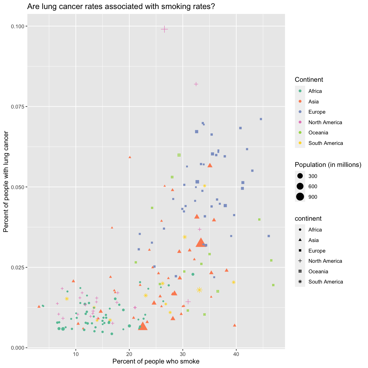
ggplot(data = smoking_1990) +
  aes(x = smoke_pct) +
  labs(x = "Percent of people who smoke") +
  aes(y = lung_cancer_pct) +
  labs(y = "Percent of people with lung cancer") +
  geom_point() +
  labs(title = "Are lung cancer rates associated with smoking rates?") +
  aes(_____)
What information can you learn from the plot?
Solution
ggplot(data = smoking_1990) +
  aes(x = smoke_pct) +
  labs(x = "Percent of people who smoke") +
  aes(y = lung_cancer_pct) +
  labs(y = "Percent of people with lung cancer") +
  geom_point() +
  labs(title = "Are lung cancer rates associated with smoking rates?") +
 aes(color = continent)
Here we can see that in 1990 the African countries tended to have much lower smoking and lung cancer rates than many other continents.
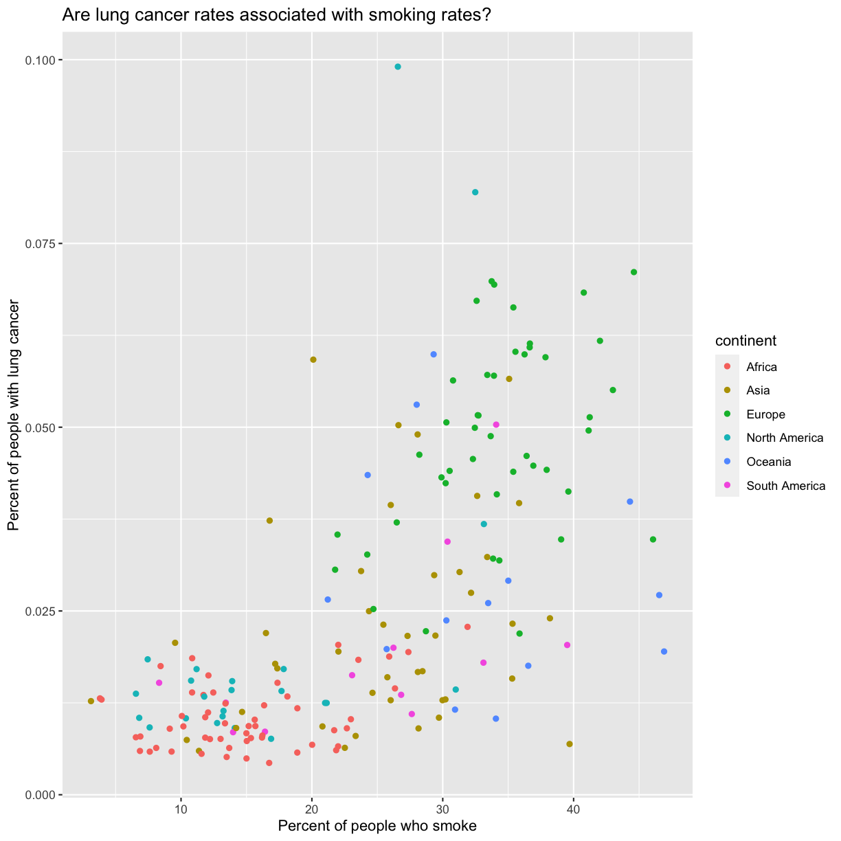
Notice that when we add a mapping for
color, ggplot automatically provided a legend for us. It took care of assigning
different colors to each of our unique values of the continent variable. (Note
that when we mapped the x and y values, those drew the actual axis labels, so in
a way the axes are like the legends for the x and y values).
The colors that ggplot uses are determined by the color “scale”. Each aesthetic value we can supply (x, y, color, etc) has a corresponding scale. Let’s change the colors to make them a bit prettier. While we’re at it, let’s capitalize the legend title too.
ggplot(data = smoking_1990) +
  aes(x = smoke_pct) +
  labs(x = "Percent of people who smoke") +
  aes(y = lung_cancer_pct) +
  labs(y = "Percent of people with lung cancer") +
  geom_point() +
  labs(title = "Are lung cancer rates associated with smoking rates?") +
  aes(color = continent) +
  scale_color_brewer(palette = "Set2") +
  labs(color = "Continent")
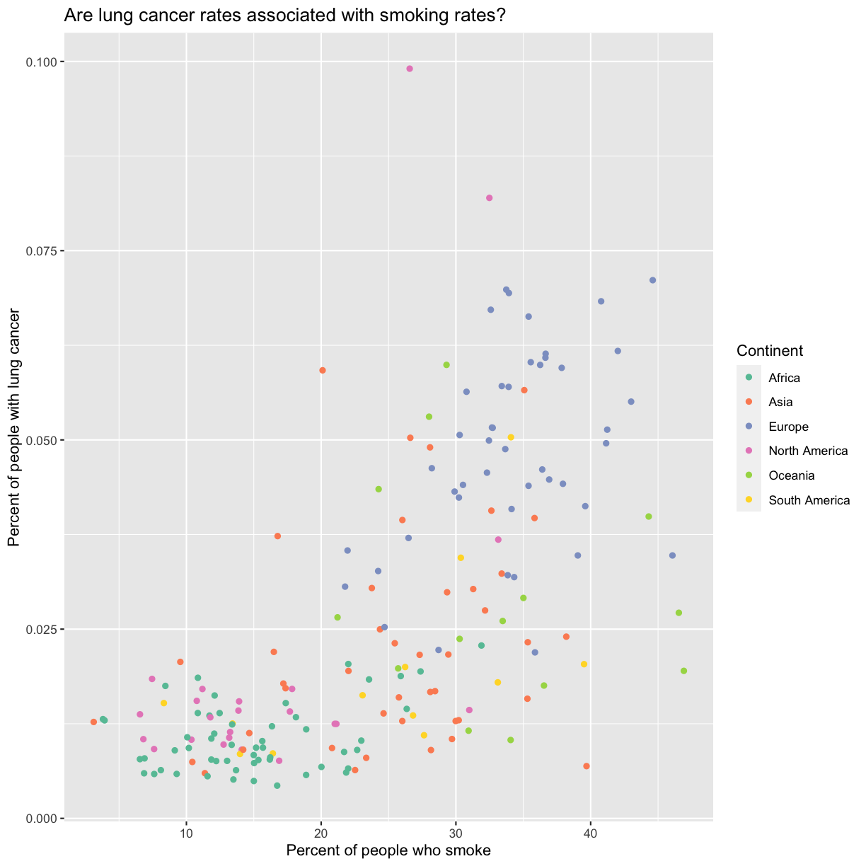
The scale_color_brewer() function is just one of many you can use to change
colors. There are bunch of “palettes” that are build in. You can view them all
by running RColorBrewer::display.brewer.all() or check out the Color Brewer
website for more info about choosing plot colors.
Check out the bonus exercise below for even more options.
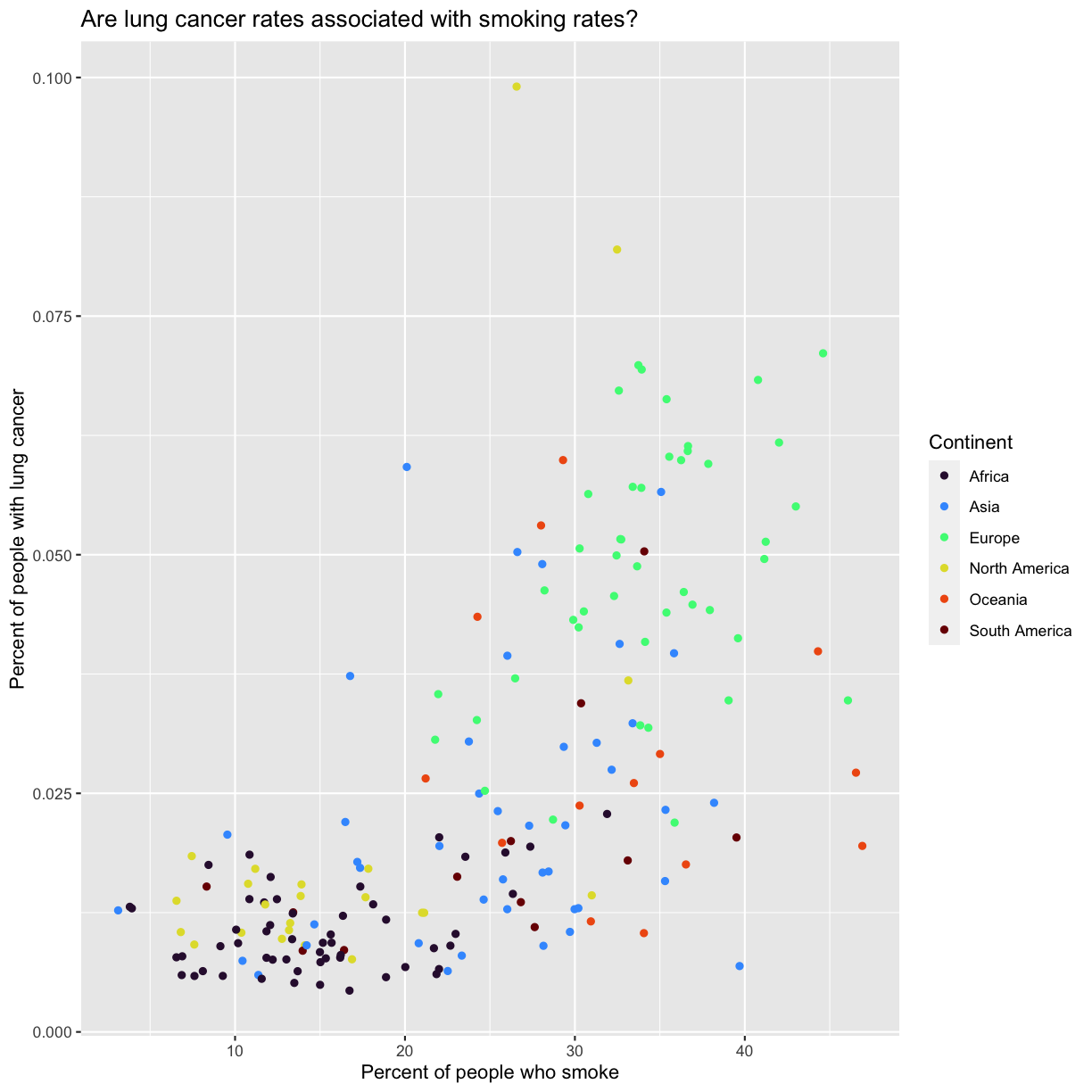
Bonus Exercise: Changing colors
There are lots of ways to change colors when using ggplot. The
scale_color_brewer()function is one of many you can use to change colors. There are bunch of “palettes” that are build in. You can view them all by runningRColorBrewer::display.brewer.all()or check out the Color Brewer website for more info about choosing plot colors. There are also lots of other fun options:Play around with different color palettes. Feel free to install another package and choose one of those if you want. Pick your favorite!
Solution
You can use RColorBrewer::display.brewer.all() to pick a color palette. As a bonus, you can also use one of the packages listed above. Here’s an example:
ggplot(data = smoking_1990) +
  aes(x = smoke_pct) +
  labs(x = "Percent of people who smoke") +
  aes(y = lung_cancer_pct) +
  labs(y = "Percent of people with lung cancer") +
  geom_point() +
  labs(title = "Are lung cancer rates associated with smoking rates?") +
  aes(color = continent) +
  labs(color = "Continent") +
  scale_color_viridis_d(option = "turbo")
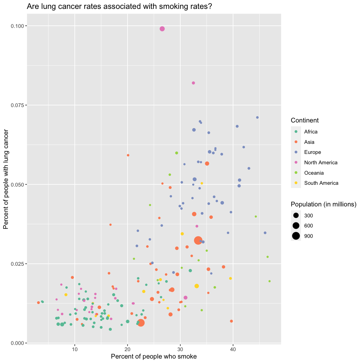
Since we have the data for the population of each country, we might be curious about the relationship between population, smoking rates, and lung cancer rates. Do you think larger countries will have a greater or lower lung cancer rate? Let’s find out by mapping the population of each country to the size of our points.
Changing point sizes
Map the population of each country to the size of our points. HINT: Is size an aesthetic or a geometry? If you’re stuck, feel free to Google it, or look at the help menu.
Solution
ggplot(data = smoking_1990) + aes(x = smoke_pct) + labs(x = “Percent of people who smoke”) + aes(y = lung_cancer_pct) + labs(y = “Percent of people with lung cancer”) + geom_point() + labs(title = “Are lung cancer rates associated with smoking rates?”) + aes(color = continent) + scale_color_brewer(palette = “Set2”) + labs(color = “Continent”) ```
There doesn’t seem to be a very strong association with population size. We also got another legend here for size, which is nice, but the values look a bit ugly in scientific notation. Let’s divide all the values by 1,000,000 and label our legend “Population (in millions)”
ggplot(data = smoking_1990) +
  aes(x = smoke_pct) +
  labs(x = "Percent of people who smoke") +
  aes(y = lung_cancer_pct) +
  labs(y = "Percent of people with lung cancer") +
  geom_point() +
  labs(title = "Are lung cancer rates associated with smoking rates?") +
  aes(color = continent) +
  scale_color_brewer(palette = "Set2") +
  labs(color = "Continent") +
  aes(size = pop/1000000) +
  labs(size = "Population (in millions)")

This works because you can treat the columns in the aesthetic mappings just like any other variables and can use functions to transform or change them at plot time rather than having to transform your data first.
Good work! Take a moment to appreciate what a cool plot you made with a few lines of code. To fully view its beauty you can click the “Zoom” button in the Plots tab - it will break free from the lower right corner and open the plot in its own window.
Bonus Exercise: Changing shapes
Instead of (or in addition to) color, change the shape of the points so each continent has a different shape. (I’m not saying this is a great thing to do - it’s just for practice!) HINT: Is shape an aesthetic or a geometry? If you’re stuck, feel free to Google it, or look at the help menu.
Solution
You’ll want to use the
aesaesthetic function to change the shape:ggplot(data = smoking_1990) + aes(x = smoke_pct) + labs(x = "Percent of people who smoke") + aes(y = lung_cancer_pct) + labs(y = "Percent of people with lung cancer") + geom_point() + labs(title = "Are lung cancer rates associated with smoking rates?") + aes(color = continent) + scale_color_brewer(palette = "Set2") + labs(color = "Continent") + aes(size = pop) + aes(size = pop/1000000) + labs(size = "Population (in millions)") + aes(shape = continent)
For our first plot we added each line of code one at a time so you could see the
exact affect it had on the output. But when you start to make a bunch of plots,
we can actually combine many of these steps so you don’t have to type as much.
For example, you can collect all the aes() statements and all the labs()
together. A more condensed version of the exact same plot would look like this:
ggplot(data = smoking_1990) +
  aes(x = smoke_pct, y = lung_cancer_pct, color = continent, size = pop/1000000) +
  geom_point() +
  scale_color_brewer(palette = "Set2") +
  labs(x = "Percent of people who smoke", y = "Percent of people with lung cancer",
    title = "Are lung cancer rates associated with smoking rates?", color = "Continent", size = "Population (in millions)")
Storing our plot
We learned about how to save things to object names in the previous lesson. We can do the same thing with plots! Store our final plot in an object called
cancer_v_smoke.Solution
 cancer_v_smoke <- ggplot(data = smoking_1990) +
   aes(x = smoke_pct, y = lung_cancer_pct, color = continent, size = pop/1000000) +
   geom_point() +
   scale_color_brewer(palette = "Set2") +
   labs(x = "Percent of people who smoke", y = "Percent of people with lung cancer",
     title = "Are lung cancer rates associated with smoking rates?", color = "Continent", size = "Population (in millions)")
Saving our first plot
Let’s say you want to share your plot with friends or co-workers who aren’t running R. It’s wise to keep all the code you used to draw the plot, but sometimes you need to make a PNG or PDF version of the plot so you can share it with your PI or post it to your Instagram story.
To save your plot, you can use the ggsave() function. A few things about ggsave() (the good and the bad):
- [The bad] By default,
ggsave()will save the last plot you made, but this can get confusing so it’s best to create a plot object and then save the specific plot you’re interested in instead. - [The neutral] The default width and height are sometimes not great options,
but you can supply
width=andheight=arguments to change them (the default values are in inches). - [The good] It will determine the file type based on the name you provide.
Let’s save our plot (with an informative name) as a 4x6 inch png:
ggsave(filename = "figures/cancer_v_smoke.png", plot = cancer_v_smoke, width = 6, height = 4)
Debugging code
Debugging is the process of finding and fixing errors or unexpected outputs in your code. Even well seasoned coders run into bugs all the time.
Here are some strategies of how programmers try to deal with coding errors:
- Don’t panic. Bugs are a normal part of the coding process.
- If you are getting an error message, read the error message carefully. Unfortunately, not all error messages are well written and it may not be obvious at first what is wrong.
- Check for typos.
- Check that your parentheses and quotes are balanced and check that you haven’t misspelled a variable or function name, or used the wrong one.
- It’s difficult to identify the exact location where an error starts so you may have to look at lines before the line where the error was reported.
- In RStudio, look at the code coloring to find anything that looks off. RStudio will also put a red x or an yellow exclamation point to the left of lines where there is a syntax error.
- Try running each command on its own.
- Before each command, check that you are passing the values you expect.
- After each command, verify that the results seem sensible.
- If you’re getting an error, search online for the error message along with the function that is not working.
Consider checking out the following resources to learn more about it.
- “5 Essential Tips to Debug Any Piece of Code” by mayuko [video, 8min] - Good general advice for debugging.
- “Object of type ‘closure’ is not subsettable” by Jenny Bryan [video, 50min] - A great talk with R specific advice about dealing with errors as a data scientist.
Understanding common bugs
Sometimes you accidentally type things wrong and get unexpected results or errors. We call these mis-types “bugs”. Let’s go through some common ones. The most important things to remember are:
- The order of parentheses, quotes, commas, and plusses matters.
- Sometimes you accidentally forget a plus where you need one or include one where you don’t.
For each of the examples below, figure out what the bug is and how to fix it. Feel free to copy/paste into RStudio to help you figure it out.
# Bug 1

 ggplot(data = smoking_1990) +
 aes(x = "smoke_pct", y = lung_cancer_pct, color = continent, size = pop/1000000) +
   geom_point() +
   labs(x = "Percent of people who smoke", y = "Percent of people with lung cancer",
        title = "Are lung cancer rates associated with smoking rates?",
       color = "Continent", size = "Population (in millions)")

# Bug 2

ggplot(data = smoking_1990) +
   aes(x = smoke_pct, y = lung_cancer_pct, color = continent, size = pop/1000000) +
   geom_point() +
   labs(x = "Percent of people who smoke", y = "Percent of people with lung cancer",
        title = "Are lung cancer rates associated with smoking rates?",
       color = "Continent", size = "Population (in millions)"))

# Bug 3
ggplot(data = smoking_1990) +
   aes(x = smoke_pct, y = lung_cancer_pct, color = continent, size = pop/1000000) +
   geom_point() +
   labs(x = "Percent of people who smoke", y = "Percent of people with lung cancer",
        title = "Are lung cancer rates associated with smoking rates?",
       color = "Continent" size = "Population (in millions)")
Solution
Bug 1: We generated a plot, but it doesn’t look like what we expect. The bug is in our mapping of aesthetics:
geom_point(aes(x = "smoke_pct", y = lung_cancer_pct, color = continent, size = pop/1000000)). Because"smoke_pct"is in quotation marks, ggplot understands that as a single value, rather than an aesthetic mapped to thesmoke_pctvariable in thesmoking_1990dataset. To correct this bug, remove the quotes from"smoke_pct"so that ggplot looks for thesmoke_pctcolumn in our dataset.Bug 2: This code generates the following error:
Error: unexpected ')' in:
"      scale_color_brewer(palette = "Set2") +
     labs(x = "Percent of people who smoke", y = "Percent of people  with lung cancer", title = "Are lung cancer rates associated with smoking rates?", size = "Population (in millions)"))"
Although it might be alarming to get this error, it’s actually quite helpful! You can see that the error points out that we have an unexpected closed parentheses “)” in the last two lines of our code. Look closely, and you’ll see that we accidentally put an extra “)” on the
labs()layer in the last line of code.Bug 3: This code generates the following error:
Error: unexpected symbol in:
"                       title = "Are lung cancer rates associated with smoking rates?",
                      color = "Continent" size"
This error message tells us that there was something unexpected in the
labs()funtion on either the line where we specified the title or the color. These errors can be some of the hardest to figure out, because the message is not very specific. However, if you look closely, yu will see that we are missing a comma betweencolor = "Continent"andsize = "Population (in millions)"inside the label function.
Recap of what we’ve learned so far
Now that we’ve made our first plot, let’s review the most important things to remember when plotting with ggplot. Making plots using ggplot is all about layering on information.
- First, you have to give the
ggplot()function your data.- It looks in this data for the information in the columns you tell it to use for your plot.
- Then, you have to tell ggplot what specific information from your data you want to plot and how you want that data to show up.
- You use the
aes()function for this. - Inside this function you tell it how you want the data to show up (on the x axis, on the y axis, as a color, etc.) and where that data is coming from (the column name in your datset).
- You use the
- Finally, you have to tell ggplot what type of plot you want to make.
- All ggplot plot types start with the word
geom(e.g.geom_point()).
- All ggplot plot types start with the word
- You can customize the labels and colors on your plot to make them nicer and more informative.
- There’s a lot more you can customize as well. We will go into some of this later on in the lesson.
This is a lot to remember!
Pro-tip
Those of us that use R on a daily basis use cheat sheets to help us remember how to use various R functions. You can find the cheat sheets in RStudio by going to the “Help” menu and selecting “Cheat Sheets”. The ones that will be most helpful in this workshop are “Data visualization with ggplot2”, “Data Transformation with dplyr”, “R Markdown Cheat Sheet”, and “R Markdown Reference Guide”.
For things that aren’t on the cheat sheets, Google is your best friend. Even expert coders use Google when they’re stuck or trying something new!
Let’s take a moment to orient ourselves to our “Data visualization with ggplot2” cheat sheet. What we just went over is summarized in the “Basics” section in the upper left hand side of the front page of your cheat sheet. The other sections contain more information about different geometries and aesthetics you can use in your plots. We will go over some of these in the next section.
Bonus Exercise: Make your own scatter plot
Now create your own scatter plot comparing population and percent of people who smoke. Looking at your plot, can you guess which two countries have the largest populations?
If you have extra time, customize your plot however you want. If there’s something you want to do but don’t know how, try searching on the internet for it.
Solution
ggplot(data = smoking_1990) +
  aes(x = pop, y = smoke_pct) +
  geom_point()
(China and India are the two countries with large populations.)
Plotting for data exploration
Now that we’ve made our first plot, we’re going to dig into other ways to visualize data using ggplot. The main goal here is to find meaningful patterns in complex data and create visualizations to convey those patterns.
Discrete Plots
The plot type we used to make our first plot, geom_point, works when both the x and y values are continuous. But sometimes one of your values may be discrete (i.e. categorical).
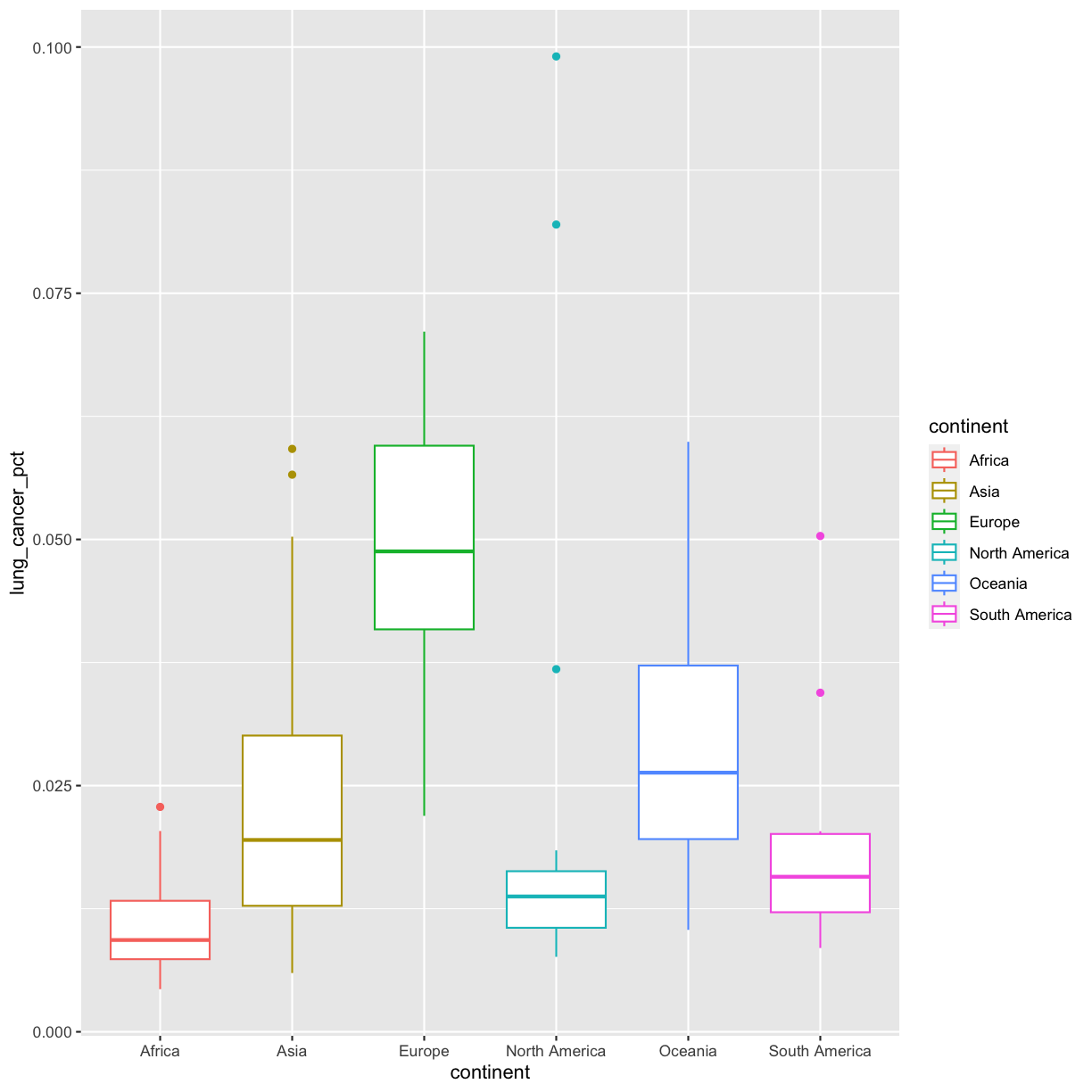
We’ve previously used the discrete values of the continent column to color in our points and lines. But now let’s try moving that variable to the x axis. Let’s say we are curious about comparing the distribution of the lung cancer rates for each of the different continents for the smoking_1990 data. We can do so using a box plot. Try this out yourself in the exercise below!
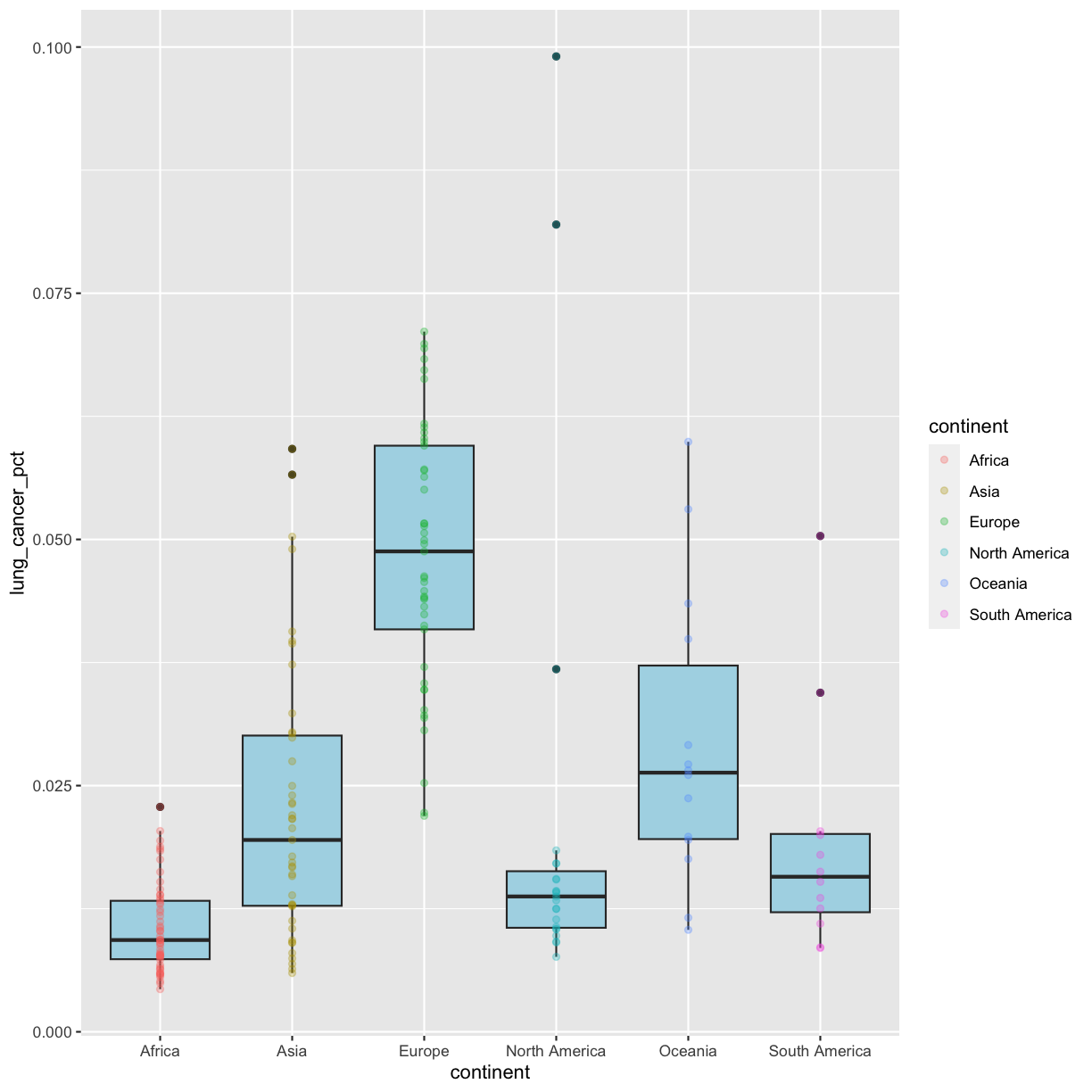
Plotting and interpreting box plots
Using the
smoking_1990data, use ggplot to create a box plot with continent on the x axis and lung cancer rates on the y axis. The geom you will want to use isgeom_boxplot(). You can use the examples from earlier in the lesson as a template to remember how to pass ggplot data and map aesthetics and geometries onto the plot. If you’re really stuck, feel free to use the internet as well!Which continent tends to have countries with the highest lung cancer rates? The lowest?
Solution
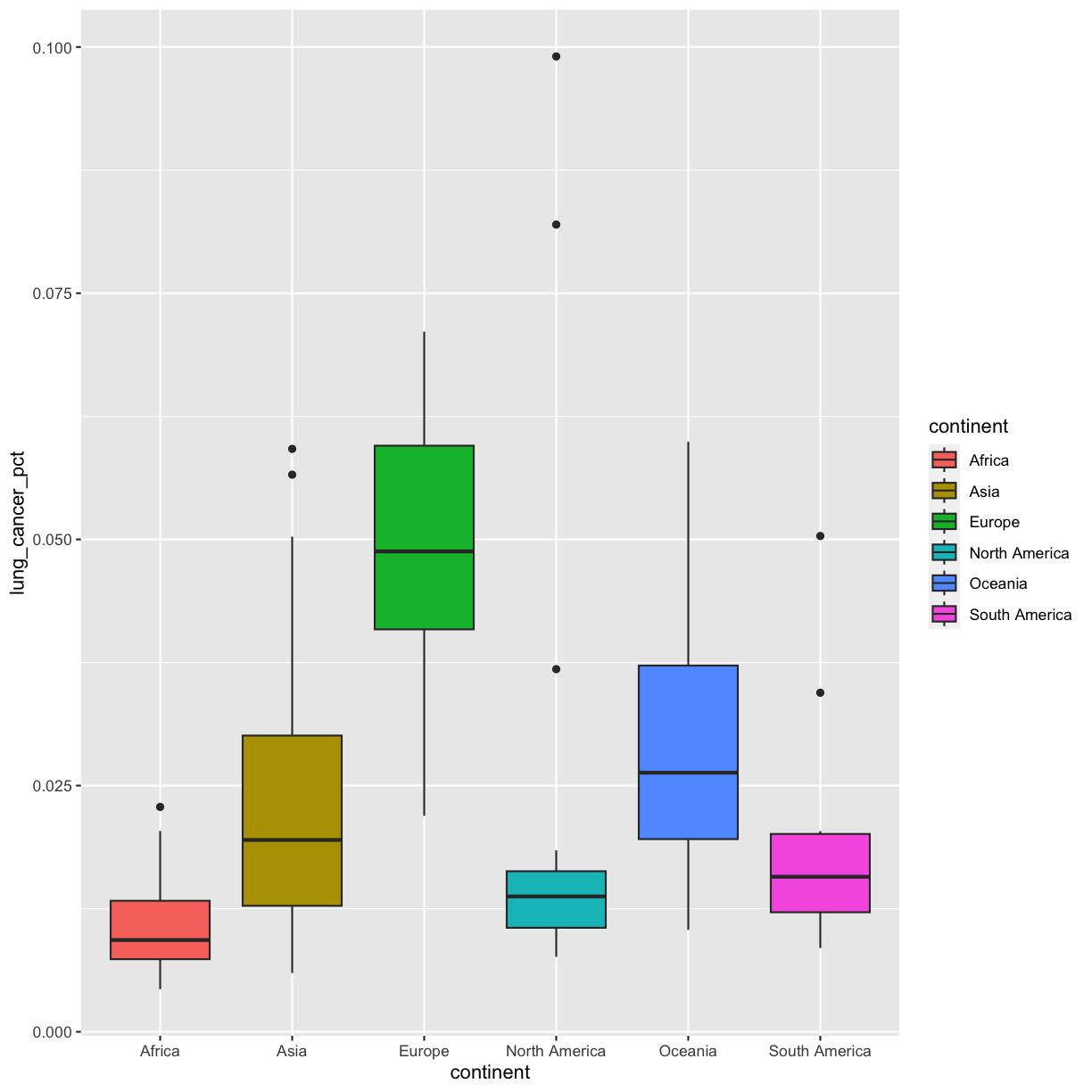
ggplot(data = smoking_1990) +
 aes(x = continent, y = lung_cancer_pct) +
 geom_boxplot()
This type of visualization makes it easy to compare the range and spread of values across groups. The “middle” 50% of the data is located inside the box and outliers that are far away from the central mass of the data are drawn as points. The bar in the middle of the box is the median. Here, we can see that the median bar for Europe is highest, indicating that countries in Europe tend to have higher rates of lung cancer than countries on other continents. Countries in Africa tend to have lower lung cancer rates than countries on other continents.
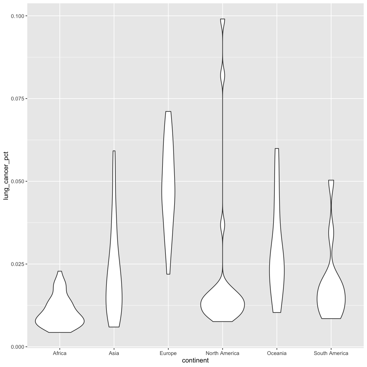
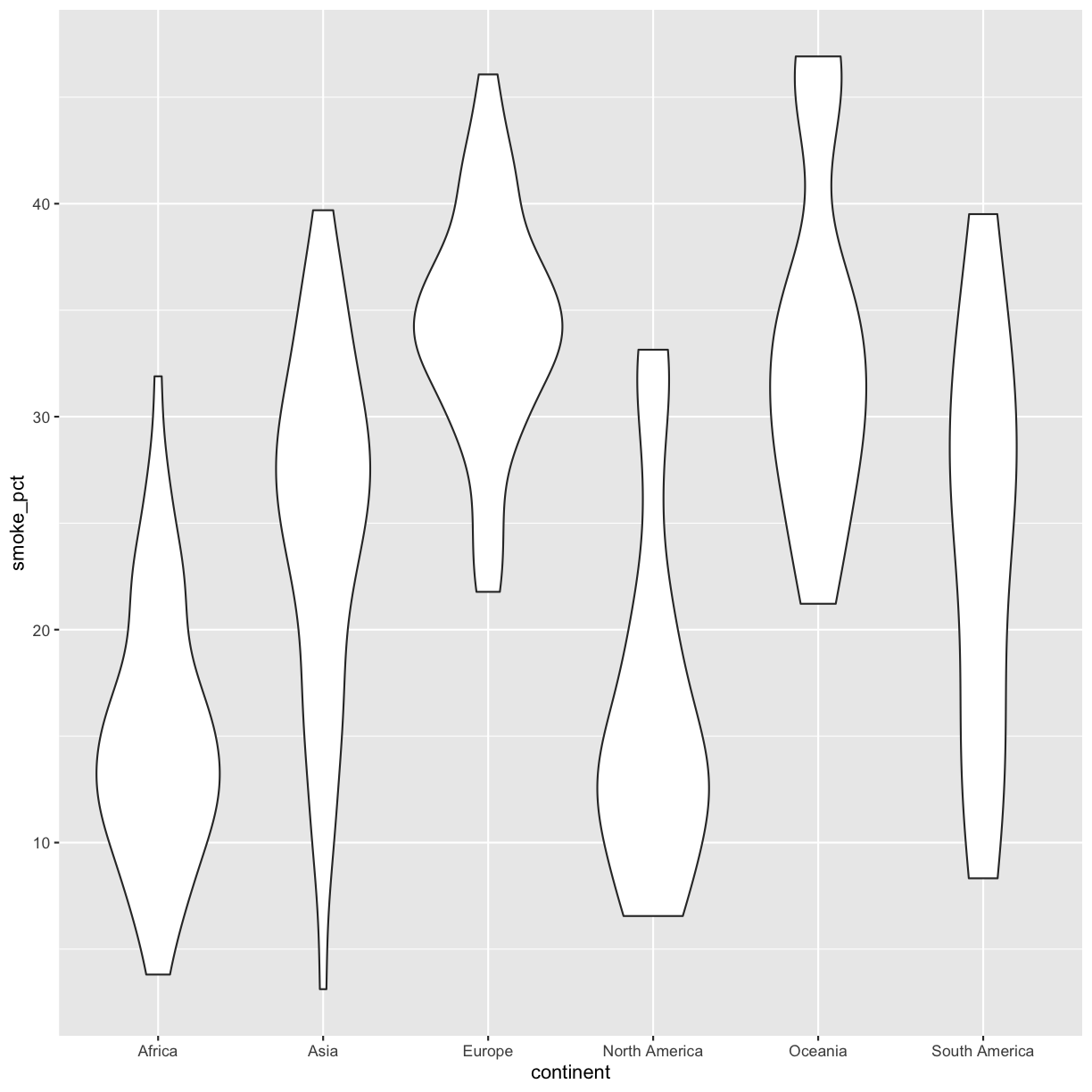
Bonus Exercise: Other discrete geoms
Take a look a the ggplot cheat sheet. Find all the geoms listed under “one discrete, one continuous.” Try replacing
geom_boxplotwith one of these other functions.Example solution
ggplot(data = smoking_1990) +
  aes(x = continent, y = lung_cancer_pct) +
  geom_violin()
Color vs. Fill
Let’s take the boxplot that we made previously and add code to make the color corresponds to continent. Remember how to do that?
ggplot(data = smoking_1990) +
  aes(x = continent, y = lung_cancer_pct, color = continent) +
  geom_boxplot()
Well, that didn’t get all that colorful. That’s because objects like these boxplots have two different parts that have a color: the shape outline, and the inner part of the shape. For geoms that have an inner part, you change the fill color with fill= rather than color=, so let’s try that instead:
ggplot(data = smoking_1990) +
  aes(x = continent, y = lung_cancer_pct, fill = continent) +
  geom_boxplot()
That got more colorful. Neither one of these (color vs. fill) is better than the other here, it’s more up to your personal preference.
Let’s say we want to change the fill of our plots, but to all the same color. Maybe we want our boxplots to be “lightblue”.
Quotes or no quotes?
To change the color of our boxplots to lightblue, do you think we need to put lightblue in quotes or not? Why?
Solution
We want to put it in quotes because it isn’t a column name in our dataset or a variable in our environment.
Let’s try it out without quotes first:
ggplot(data = smoking_1990) +
  aes(x = continent, y = lung_cancer_pct, fill = lightblue) +
  geom_boxplot()
Error in `geom_boxplot()`:
! Problem while computing aesthetics.
ℹ Error occurred in the 1st layer.
Caused by error:
! object 'lightblue' not found
Like we just discussed, we get an error because when we don’t include quotes, R looks for the lightblue object in our dataframe and our environment, but it doesn’t find it there. Instead, we have to put it in quotes so that R knows not to search for that variable, but instead to actually use the word itself:
ggplot(data = smoking_1990) +
  aes(x = continent, y = lung_cancer_pct, fill = "lightblue") +
  geom_boxplot()
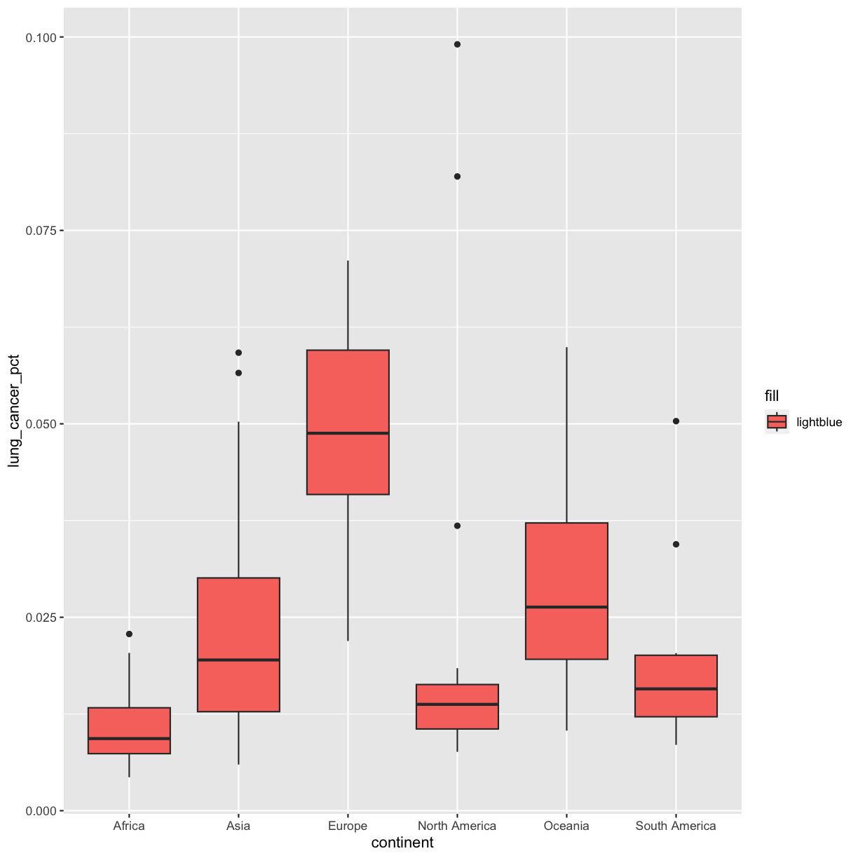
Hmm that’s still not quite what we want. In this example, we placed the fill inside the aes() function, which maps aesthetics to data. In this case, we only have one value: the word “lightblue”. Instead, let’s do this by explicitly setting the color aesthetic inside the geom_boxplot() function. Because we are assigning a color directly and not using any values from our data to do so, we do not need to use the aes() mapping function. Let’s try it out:
ggplot(data = smoking_1990) +
  aes(x = continent, y = lung_cancer_pct) +
  geom_boxplot(fill = "lightblue")

That’s better! R knows many color names. You can see the full list if you run colors() in the console. Since there are so many, you can randomly choose 10 if you run sample(colors(), size = 10).
Choosing a color
Use
sample(colors(), size = 10)a few times until you get an interesting sounding color name and swap that out for “lightblue” in the box plot example.
Layers
So far we’ve only been adding one geom to each plot, but each plot object can actually contain multiple layers and each layer has it’s own geom. Now let’s add a layer of points on top of our boxplot that will show us the “raw” data:
ggplot(data = smoking_1990) +
  aes(x = continent, y = lung_cancer_pct) +
  geom_boxplot(fill = "lightblue") +
  geom_point()

We’ve drawn the points but most of them stack up on top of each other. One way to make it easier to see all the data is to change the transparency of the points. We can do this using the alpha argument, which decides how transparent to make the points. It takes a value between 0 and 1 where 0 is entirely transparent and 1 is entirely opaque (the default).
Inside
aes()orgeom?Let’s say we want to change the transparency of our points to an alpha of 0.3. Do we want alpha to go inside our
aes()function or ourgeom_boxplot()? Why? Test out both and see if you’re right!Solution
We want alpha to go inside
geom_boxplot()since we’re telling ggplot the number we want it to use; it’s not coming from our data.ggplot(data = smoking_1990) + aes(x = continent, y = lung_cancer_pct) + geom_boxplot(fill = "lightblue") + geom_point(alpha = 0.3)
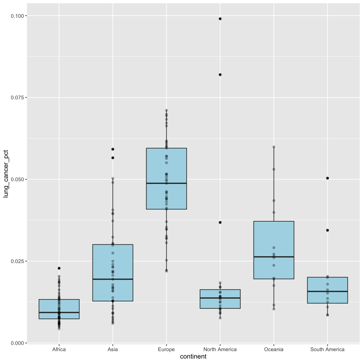
Bonus: Too many overlapping points for alpha to work?
We have many observations/data points, so even making the points transparent doesn’t really help us see them! Another option is to “jitter” the points. This adds some random variation to the position of the points so you can see them better. We can do this using
geom_jitter().WARNING!!!
geom_jitter()changes the position of points and should therefore only be used for discrete variables that don’t have numerical values!!!Since we are plotting a discrete value on the x axis, and a continuous value on the y axis, we will need to tell
geom_jitter()not to change the y value positions. We can do this by settingheight = 0inside the geom. We will also modify the degree to which points are jittered on the x axis by setting thewidthargument. Feel free to play around withwidthto get a plot that you like. Remember, we can only do this because the x axis is discrete!ggplot(data = smoking_1990) + aes(x = continent, y = lung_cancer_pct) + geom_boxplot(fill = "lightblue") + geom_jitter(alpha = 0.3, height = 0, width = 0.05)
That looks better!
Predicting output
What do you think will happen if you switch the order of
geom_boxplot()andgeom_point()? Why? Test it out to see if you were right.Solution
Since we plot the
geom_point()layer first, the boxplot layer is placed on top of thegeom_point()layer, so we cannot see a lot of the points.ggplot(data = smoking_1990) + aes(x = continent, y = lung_cancer_pct) + geom_point(, alpha = 0.3) + geom_boxplot(fill = "lightblue")

Going back to having the points on top, let’s color the points by continent. If we add a color aesthetic to the plot, then both the boxplot and the points are colored by continent:
ggplot(data = smoking_1990) +
  aes(x = continent, y = lung_cancer_pct, color = continent) +
  geom_boxplot(fill = "lightblue") +
  geom_point(alpha = 0.3)
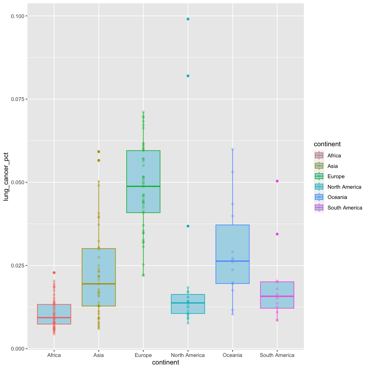
So how do we make it so that just the points are colored but not the boxplots? Each layer can have it’s own set of aesthetic mappings. So far we’ve been using aes() outside of the other functions. When we do this, we are setting the “default” aesthetic mappings for the plot. But we can also set the asethetics inside the specific geom that we want to change. To do that, you can place an additional aes() inside of that layer:
ggplot(data = smoking_1990) +
  aes(x = continent, y = lung_cancer_pct) +
  geom_boxplot(fill = "lightblue") +
  geom_point(aes(color = continent), alpha = 0.3)
Nice! Both geom_boxplot() and geom_point() will inherit the default values of aes(continent, lung_cancer_pct) in the base plot, but only geom_jitter will also use aes(color = continent).
Bonus: Aesthetics inside the
ggplot()functionInstead of mapping our aesthetics to each geom, we can provide default aesthetics by passing the values to the
ggplot()function call. Any aesthetics we want to be specific to a layer, we would keep in the geom function for that layer:ggplot(data = smoking_1990, mapping = aes(x = continent, y = lung_cancer_pct)) + geom_boxplot(fill = "lightblue") + geom_point(aes(color = continent), alpha = 0.3)
Here, both
geom_boxplot()andgeom_point()will inherit the default values ofaes(continent, lung_cancer_pct)in the base plot, but onlygeom_point()will also useaes(color = continent).
Bonus Exercise: Make your own violin plot
Now create a violin plot comparing percent of people in a country who smoke by continent.
If you have extra time, customize your plot however you want. If there’s something you want to do but don’t know how, try searching on the internet for it.
Solution
ggplot(data = smoking_1990) +
  aes(x = continent, y = smoke_pct) +
  geom_violin()
Univariate Plots
We jumped right into make plots with multiple columns. But what if we wanted to take a look at just one column? This can be really useful if we want to understand how certain continuous exposures or outcomes are distributed in our dataset. In that case, we only need to specify a mapping for x and choose an appropriate geom.
Univariate continuous
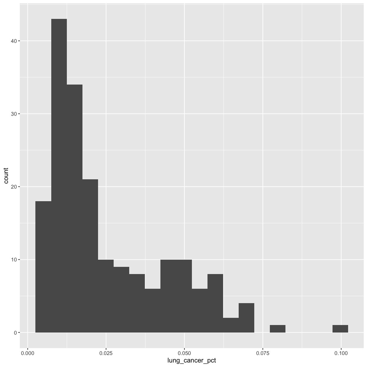
Let’s start with a histogram to see the range and spread of the lung cancer rates:
ggplot(smoking_1990) +
  aes(x = lung_cancer_pct) +
  geom_histogram()
`stat_bin()` using `bins = 30`. Pick better value with `binwidth`.
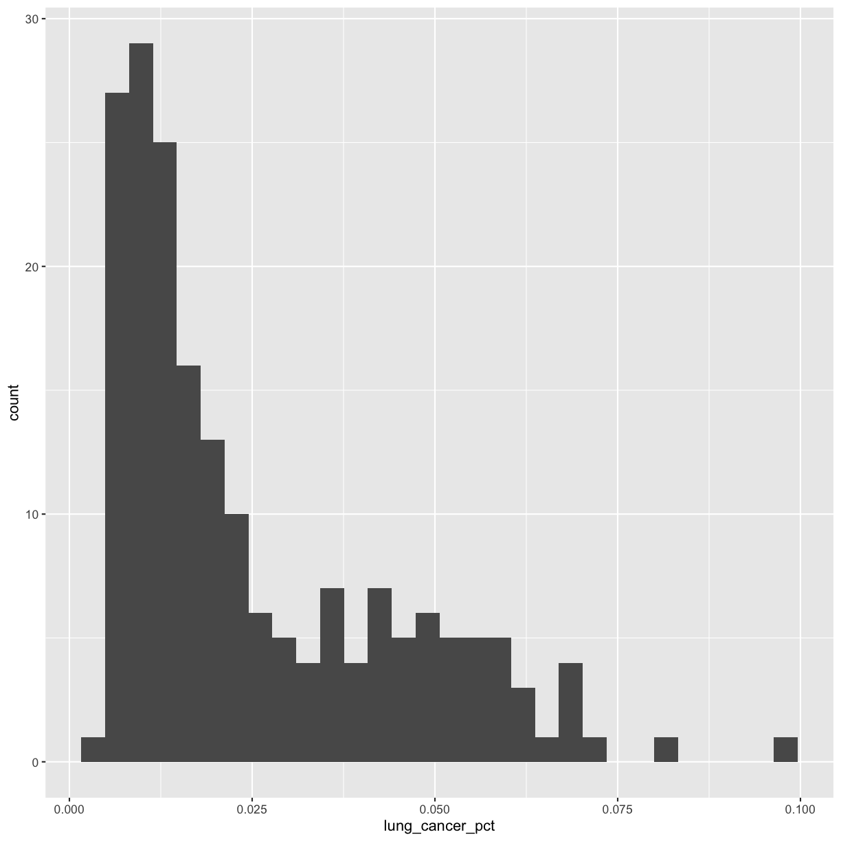
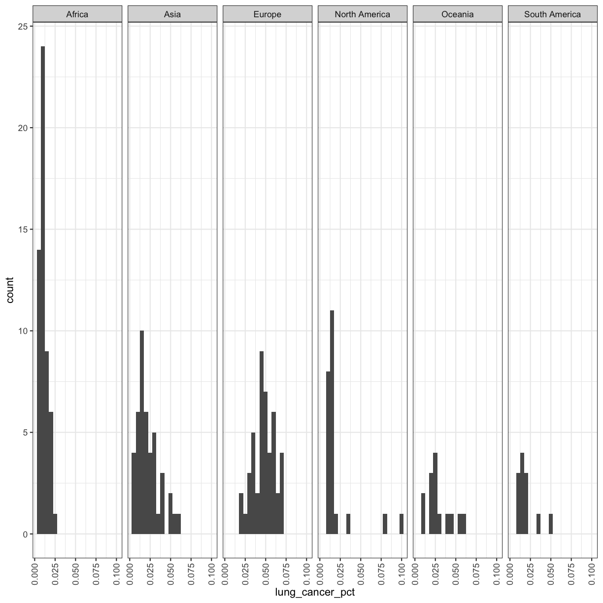
This plot shows us that many of the lung cancer rates in our dataset are really low (less than 0.025%), but there are some outliers with higher rates. Another word for data with this shape is right-skewed, because it has a long tail on the right side of the histogram.
When you ran the code to make the histogram, you should not only see the plot in the plot window, but also a message telling you to choose a better bin value. Histograms can look very different depending on the number of bars you decide to draw. The default is 30. Let’s try setting a different value by explicitly passing a bin= argument to the geom_histogram later.
ggplot(smoking_1990) +
  aes(x = lung_cancer_pct) +
  geom_histogram(bins=20)

Try different values like 5 or 50 to see how the plot changes.
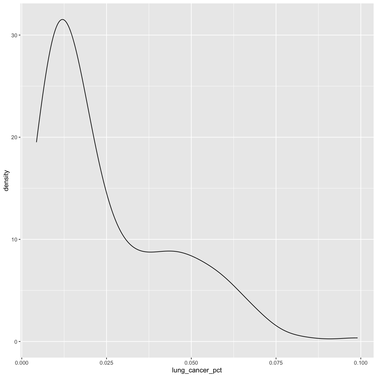
Bonus Exercise: One variable plots
Rather than a histogram, choose one of the other geometries listed under “One Variable” continuous plots on the ggplot cheat sheet.
Example solution
ggplot(smoking_1990) +
  aes(x = lung_cancer_pct) +
  geom_density()
Univariate discrete
What if we want to plot a univariate discrete variable, like continent? For this, we can use a bar chart.
Exercise: Discrete univariate plots
Create a bar plot of
continentthat shows the number of data points we have for each continent. You can try guessing the geom or look it up on the cheat sheet or Internet. Which continents have the most and fewest countries? How can you tell?Example solution
ggplot(smoking_1990) +
  aes(x = continent) +
  geom_bar()
Africa has the most countries and Oceania has the fewest. We can tell this because Africa has the highest bar and Oceania has the lowest.
Facets
If you have a lot of different columns to try to plot or have distinguishable subgroups in your data, a powerful plotting technique called faceting might come in handy. When you facet your plot, you basically make a bunch of smaller plots and combine them together into a single image. Luckily, ggplot makes this very easy. Let’s start with the histogram that we were just working with:
ggplot(smoking_1990) +
  aes(x = lung_cancer_pct) +
  geom_histogram(bins=20)
Now, let’s draw a separate box for each continent. We can do this with facet_wrap()
ggplot(smoking_1990) +
  aes(x = lung_cancer_pct) +
  geom_histogram(bins=20) +
  facet_wrap(vars(continent))
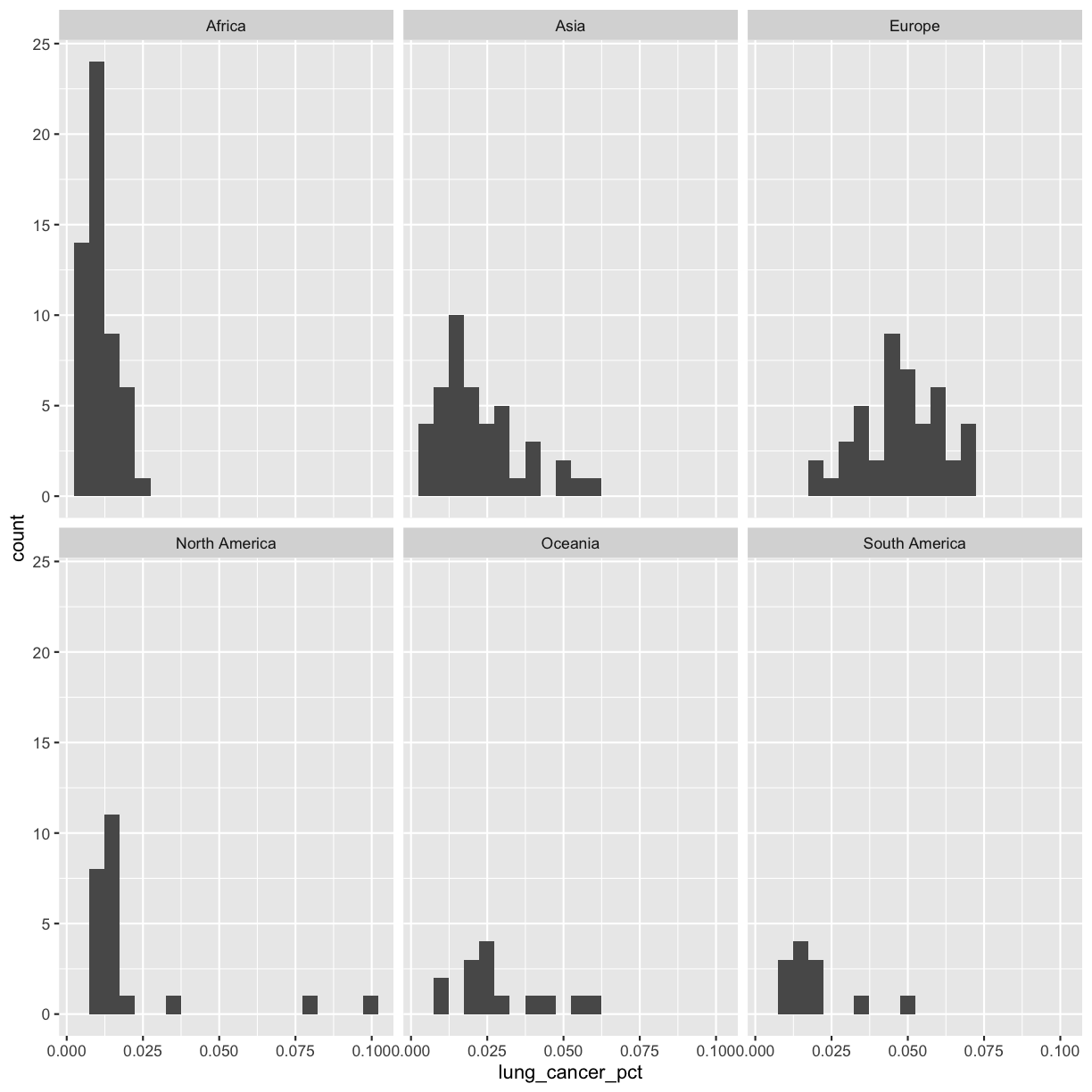 Now, it’s easier to see the patterns within and between continents.
Note that facet_wrap requires an extra helper function called vars() in order to pass in the column names. It’s a lot like the aes() function, but it doesn’t require an aesthetic name. We can see in this output that we get a separate box with a label for each continent so that only the values for that continent are in that box.
The other faceting function ggplot provides is facet_grid(). The main difference is that facet_grid() will make sure all of your smaller boxes share a common axis. In this example, we will put the boxes into columns side-by-side so that their y axes all line up. We can do this using the cols argument inside facet_grid.
ggplot(smoking_1990) +
  aes(x = lung_cancer_pct) +
  geom_histogram(bins=20) +
  facet_grid(cols = vars(continent))
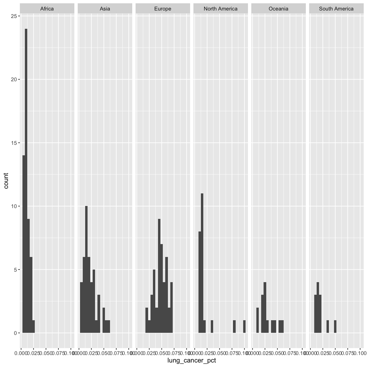
Unlike the facet_wrap output where each box got its own x and y axis, with facet_grid(), there is only one y axis along the left.
Exercise: Faceting
Facet the scatter plot we made as our first plot by continent. Are there differences in correlation between continents?
Solution
You can copy all the code from the first plot, or you can use the saved variable that we made above and add to that:
cancer_v_smoke +
  facet_wrap(vars(continent))
There don’t seem to be many differences between continents.
Bonus Exercise: Practice saving
Store the plot you made above in an object named
my_plot, and save the plot usingggsave().Example solution
my_plot <- cancer_v_smoke +
  facet_wrap(vars(continent))

ggsave("cancer_v_smoke_faceted.jpg", plot = my_plot, width=6, height=4)
Plot Themes
Our plots are looking pretty nice, but what’s with that grey background? While you can change various elements of a ggplot object manually (background color, grid lines, etc.) the ggplot package also has a bunch of nice built-in themes to change the look of your graph. For example, let’s try adding theme_bw() to our histogram:
ggplot(smoking_1990) +
  aes(x = lung_cancer_pct) +
  geom_histogram(bins=20) +
  facet_grid(cols = vars(continent)) +
  theme_bw()
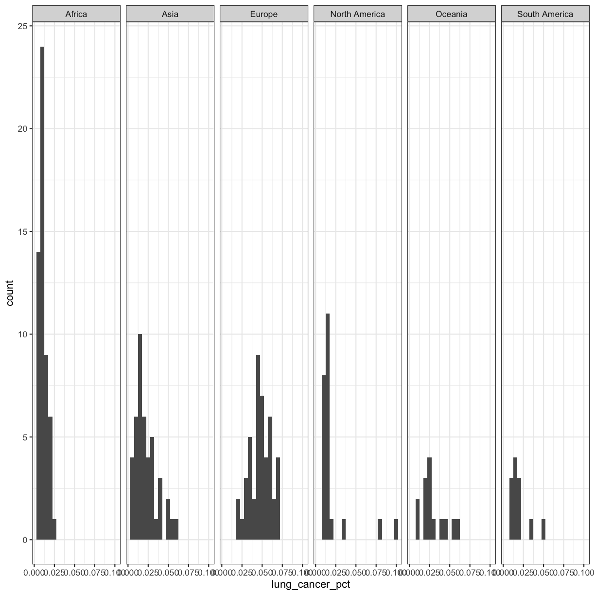
Try out a few other themes, to see which you like: theme_classic(), theme_linedraw(), theme_minimal().
Rotating x axis labels
Often, you’ll want to change something about the theme that you don’t know how to do off the top of your head. When this happens, you can do an Internet search to help find what you’re looking for. To practice this, search the Internet to figure out how to rotate the x axis labels 90 degrees. Then try it out using the histogram plot we made above.
Solution
ggplot(smoking_1990) +
 aes(x = lung_cancer_pct) +
 geom_histogram(bins=20) +
 facet_grid(cols = vars(continent)) +
 theme_bw() +
  theme(axis.text.x = element_text(angle = 90, vjust = 0.5, hjust=1))
Plotting for data exploration recap
We learned a lot in this lesson! Let’s go over the key points:
- ggplot is a powerful way to make plots.
- ggplot is all about layering - you can layer different geometries, aesthetics, labels, and other information onto your plots.
- You can customize the color, size, shape, and theme of your plots.
- ggplot allows you to easily save publication-quality plots.
- There are lots of different plot types. Some of the most useful ones are:
- Scatter plots (for two continuous variables).
- Boxplots (for one discrete and one continuous variable).
- Histograms (for one continuous variable).
- Bar plots (for one discrete variable).
- Faceting allows you to easily make the same plot separated by a discrete variable of interest.
With the skills you’ve learned here, you’re now ready to start doing your own data exploration!
Applying it to your own data
Now that we’ve learned how impactful effective data visualization can be, and how to create informative visuals in R, it’s time for you to start thinking about what you want to do with your own data!
Discuss with your group your data and what type of exploratory data analysis you would like to perform.
Questions to answer:
- In 1-2 sentences, describe the information covered in your dataset.
- How large is your dataset? How many rows? How many columns?
- Write down 3 specific questions you could answer with your data set.
- Think through 3 data visualizations that can answer the questions you have. Specifically, for each one: a) Write down your question or goal for the plot. b) Write down the variables needed to answer your question. c) Choose a geometry. d) Choose an aesthetic for each variable. e) Draw a draft plot with pen and paper to determine whether you think these choices will work.
Glossary of terms
- Tibble: the way tabular data is stored in R when using the tidyverse. We may also call it a data frame.
- Geometry (geom): this describes the things that are actually drawn on the plot (like points or lines)
- Aesthetic: a visual property of the objects (geoms) drawn in your plot (like x position, y position, color, size, etc)
- Aesthetic mapping (aes): This is how we connect a visual property of the plot to a column of our data
- Labels (labs): Text labels that make your plot clearer to understand.
- Facets: Dividing your data into non-overlapping groups and making a small plot for each subgroup
- Layer: Each ggplot is made up of one or more layers. Each layer contains one geometry and may also contain custom aesthetic mappings and private data
- Theme: Allows you to change and customize the look of your plot.
Key Points
Use
read_csv()to read tabular data in R.Geometries are the visual elements drawn on data visualizations (lines, points, etc.), and aesthetics are the visual properties of those geometries that are assigned to variables in the data (color, position, etc.).
Use
ggplot()and geoms to create data visualizations, and save them usingggsave().