R for Data Analysis
Overview
Teaching: 75 min
Exercises: 15 minQuestions
How can I summarise my data in R?
How can R help make my research more reproducible?
Objectives
To become familiar with the functions of the
dplyrandtidyrpackages.To be able to create plots and summary tables to answer analysis questions.
Contents
- Day 2 review
- Overview of the lesson
- Get stats fast with
summarise() - Plotting for exploratory data analysis
- [Bonus content] (#bonus-content)
- Calculating percentages
- Changing the shape of the data
- Plotting wide data
- Additional practice
- Applying it to your own data
Day 2 review
Yesterday we learned all about data cleaning, but we didn’t cover everything.
- Make a list of what we learned yesterday related to data cleaning.
- Make a list of things we didn’t learn yesterday that you sometimes have to do while data cleaning.
- Choose one item from the list of things we didn’t learn and use the Internet to search for a way to do it using the
tidyverse.
Overview of the lesson
So far, you’ve learned how to load, plot, merge, and clean data. In the process, you’ve learned a lot of new functions which are useful for transforming data. Today, we are going to put all those new skills you learned together and learn a few new functions that will be really helpful for exploratory data analysis. We’ll start with a few examples of how plotting can be a really useful tool for exploratory data analysis. Then, we’ll learn a function that will help us get summary statistics for our data and compare those summary statistics to plots. We’ll also learn how to calculate proportions and percentages. Finally, we’ll learn how to change the shape of data to make certain analyses more straight forward. First, let’s read in the data on smoking, lung cancer rates, and pollution that we generated yesterday:
library(tidyverse)
Warning: package 'ggplot2' was built under R version 4.3.3
Warning: package 'tibble' was built under R version 4.3.3
Warning: package 'purrr' was built under R version 4.3.3
Warning: package 'lubridate' was built under R version 4.3.3
── Attaching core tidyverse packages ──────────────────────── tidyverse 2.0.0 ──
✔ dplyr     1.1.4     ✔ readr     2.1.5
✔ forcats   1.0.0     ✔ stringr   1.5.1
✔ ggplot2   3.5.2     ✔ tibble    3.3.0
✔ lubridate 1.9.4     ✔ tidyr     1.3.1
✔ purrr     1.0.4
── Conflicts ────────────────────────────────────────── tidyverse_conflicts() ──
✖ dplyr::filter() masks stats::filter()
✖ dplyr::lag()    masks stats::lag()
ℹ Use the conflicted package (<http://conflicted.r-lib.org/>) to force all conflicts to become errors
smoking_pollution <- read_csv("data/smoking_pollution.csv")
Rows: 191 Columns: 7
── Column specification ────────────────────────────────────────────────────────
Delimiter: ","
chr (2): country, continent
dbl (5): year, pop, smoke_pct, lung_cancer_pct, pollution

ℹ Use `spec()` to retrieve the full column specification for this data.
ℹ Specify the column types or set `show_col_types = FALSE` to quiet this message.
Get stats fast with summarise()
Let’s say we would like to know the mean (average) smoking rate in the dataset. R has a built in function function called mean() that will calculate this value for us. We can apply that function to our smoke_pct column using the summarise() function. Here’s what that looks like:
smoking_pollution %>%
    summarise(mean_smoke_pct = mean(smoke_pct))
# A tibble: 1 × 1
  mean_smoke_pct
           <dbl>
1           23.9
When we call summarise(), we can use any of the column names of our data object as values to pass to other functions. summarise() will return a new data object and our value will be returned as a column.
Note: The
summarise()andsummarise()functions perform identical functions.
The mean_smoke_pct= part tells summarise() to use “mean_smoke_pct” as the name of the new column. Note that you don’t have to have quotes around this new name as long as it starts with a letter and doesn’t include a space.
When you call summarise(), you can also create more than one new column. To do so, you must separate your columns with a comma. Building on the code from above, let’s add a new column that calculates the minimum and maximum percent of smokers.
smoking_pollution %>%
  summarise(mean_smoke_pct=mean(smoke_pct),
            min_smoke_pct=min(smoke_pct),
            max_smoke_pct=max(smoke_pct))
# A tibble: 1 × 3
  mean_smoke_pct min_smoke_pct max_smoke_pct
           <dbl>         <dbl>         <dbl>
1           23.9          3.12          46.9
Perhaps one of the most powerful ways to use summarise() is to combine it with group_by(). This enables you to calculate summary statistics for specific groups. For example, suppose we wanted to calculate the the mean, min, and max smoke_pct for each continent. How would you modify the code above?
smoking_pollution %>%
    group_by(continent) %>%
    summarise(mean_smoke_pct=mean(smoke_pct),
            min_smoke_pct=min(smoke_pct),
            max_smoke_pct=max(smoke_pct))
# A tibble: 6 × 4
  continent     mean_smoke_pct min_smoke_pct max_smoke_pct
  <chr>                  <dbl>         <dbl>         <dbl>
1 Africa                  15.0          3.81          31.9
2 Asia                    25.1          3.12          39.7
3 Europe                  34.2         21.8           46.1
4 North America           16.1          6.55          33.1
5 Oceania                 33.3         21.2           46.9
6 South America           24.4          8.33          39.5
Exercise: Summary stats and boxplots
Part 1: Use
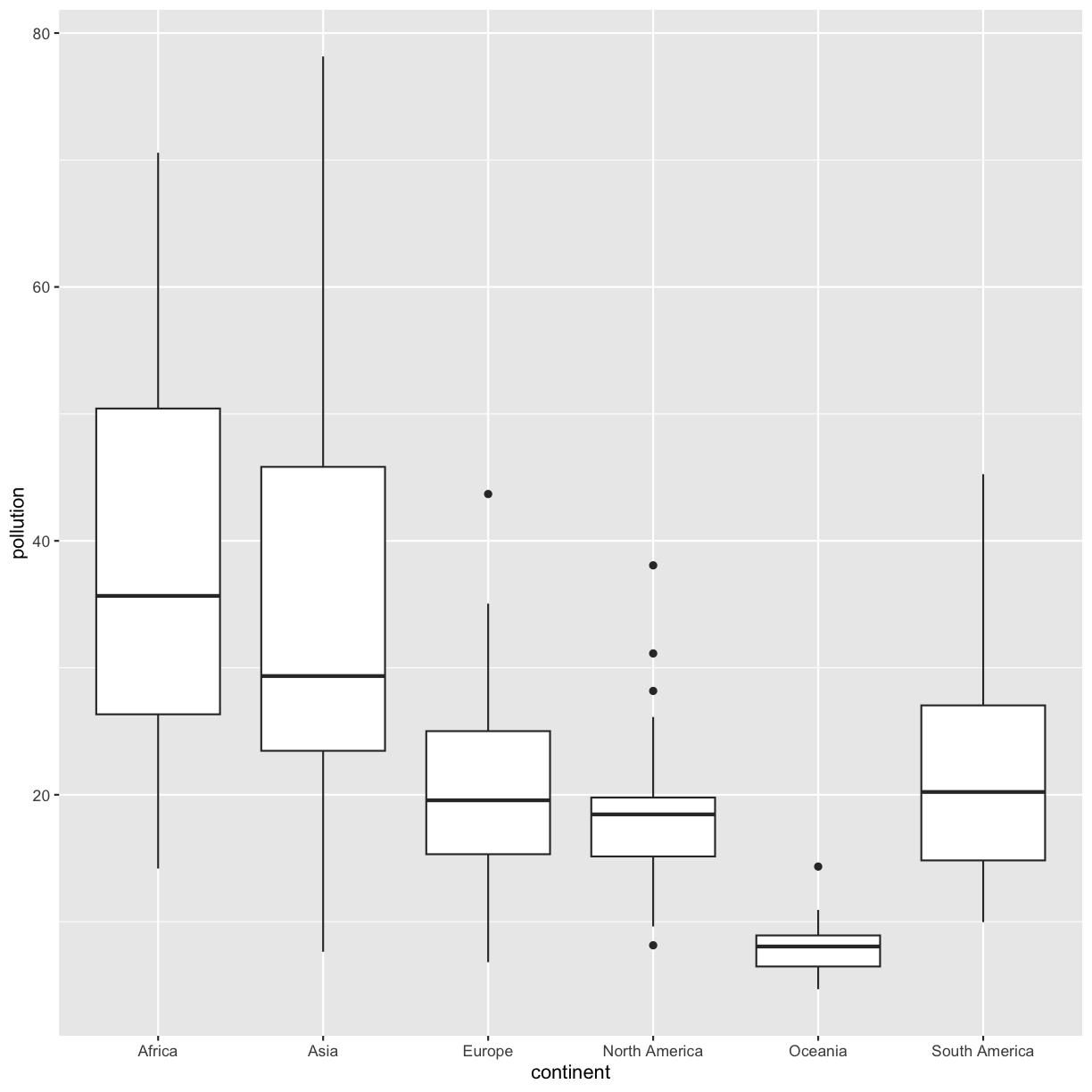
group_by()andsummarise()to find the median, min, max, and interquartile range oflung_cancer_pctfor each continent.Part 2: Make a box plot of
pollutionon the y axis and continent on the x axis. Compare your plot to your table. What do you notice? Which do you think is easier to interpret?Solution
Part 1: Use
group_by()andsummarise()to find the median, min, max, and interquartile range ofpollutionfor each continent.smoking_pollution %>% group_by(continent) %>% summarise(med_pollution = median(pollution), min_pollution = min(pollution), max_pollution = max(pollution), iqr_pollution = IQR(pollution))# A tibble: 6 × 5 continent med_pollution min_pollution max_pollution iqr_pollution <chr> <dbl> <dbl> <dbl> <dbl> 1 Africa 35.7 14.2 70.6 24.1 2 Asia 29.4 7.63 78.2 22.4 3 Europe 19.6 6.81 43.7 9.69 4 North America 18.5 8.14 38.1 4.64 5 Oceania 8.05 4.69 14.3 2.45 6 South America 20.2 9.97 45.3 12.2Part 2: Make a box plot of
pollutionon the y axis and continent on the x axis. Compare your plot to your table. What do you notice?smoking_pollution %>% ggplot(aes(x = continent, y = pollution)) + geom_boxplot()
When comparing your table to your plot, you’ll notice that the dark horizontal lines represent median values. The boxes have lengths equal to the interquartile range (IQR). And the highest and lowest values for each continent match the table as well. The plot makes it easier to see differences between continents. The table provides finer details for comparison. What you choose to report will depend on whether you want to bring attention to those finer details or whether you want to discuss overall trends.
Plotting for exploratory data analysis
For our analysis, we have three questions we’d like to answer:
- Is there a relationship between population and ambient pollution levels (in micrograms per cubic meter)?
- Which continent has the highest pollution levels per capita?
- Is there a relationship between ambient pollution levels per capita and lung cancer rates?
1) Is there a relationship between population and ambient pollution levels (in micrograms per cubic meter)?
To answer this question, we’ll plot ambient pollution levels against population using a scatter plot. It will help to scale the x axis (population) log 10.
smoking_pollution %>%
  ggplot(aes(x = pop, y = pollution)) +
  geom_point() +
  scale_x_log10() +
  labs(x = "Population", y = "Ambient pollution levels (micrograms/cubic meter)",
       size = "Population\n(millions)") +
  theme_bw()
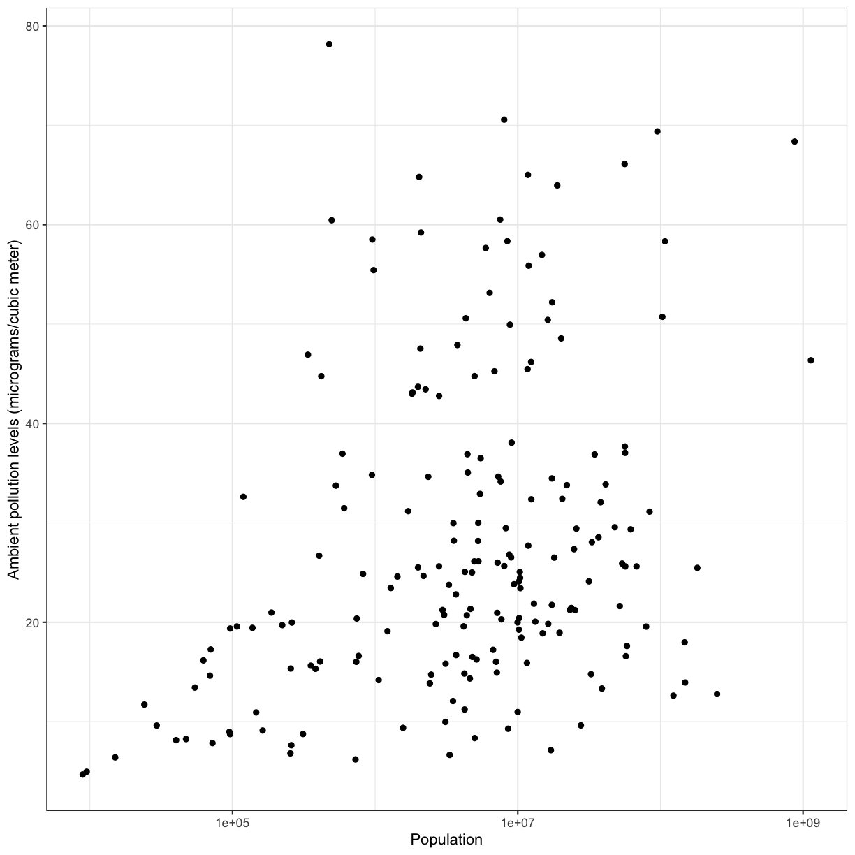
We observe a positive association between ambient pollution levels and population.
To help clarify the association, we can add a fit line through the data using geom_smooth(method = "lm"). Notice we added the method = "lm" argument. This tells geom_smooth() that we would like a linear model (lm) fit to the data.
smoking_pollution %>%
  ggplot(aes(x = pop, y = pollution)) +
  geom_point() +
  geom_smooth(method = "lm") +
  scale_x_log10() +
  labs(x = "Population", y = "Ambient pollution levels (micrograms/cubic meter)", size = "Population\n(millions)") +
  theme_bw()
`geom_smooth()` using formula = 'y ~ x'
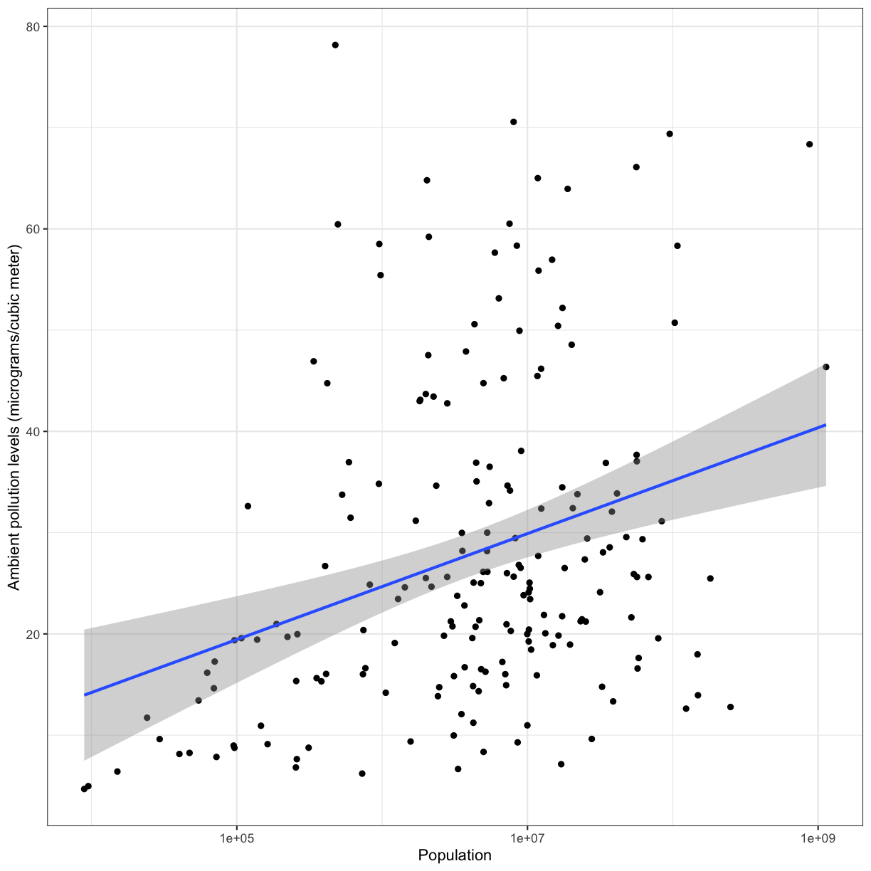
To answer our first question, we observe a positive association between population and ambient pollution. In other words, countries with higher populations tend to have higher ambient pollution levels. It is very important to remember that associations are not indicative of causality and there could be confounding variables that may be playing into this apparent relationship. Can you think of any confounding factors we haven’t accoutned for?
Challenge: 2) which continent has the highest pollution levels per capita?
To answer this question, we need to calculate the pollution levels per capita for each country using
mutate(). Then plot a boxplot to look at these levels by continent. Hint: it may help to scale the y axis log10Solution:
smoking_pollution %>%
  mutate(pollution_capita = pollution/pop) %>%
  ggplot(aes(x = continent, y = pollution_capita)) +
  geom_boxplot() +
  scale_y_log10() +
  labs(y = "Pollution (micrograms/cubic meter) per capita")+
  theme_bw()
Which continent has the highest pollution levels per capita? What other factors do you think could be driving this observation?
Challenge: 3) Is there a relationship between ambient pollution levels per capita and lung cancer rates?
To answer this question, let’s make a scatter plot with ambient pollution levels on the x axis and lung cancer rates on the y axis. Hint: Make sure to scale the x-axis log10.
Solution:
smoking_pollution %>%
  mutate(pollution_capita = pollution/pop) %>%
  ggplot(aes(x = pollution_capita, y = lung_cancer_pct)) +
  geom_point() +
  scale_x_log10() +
  labs(x = "Pollution (micrograms/cubic meter) per capita", y = "Percent of people with lung cancer")+
  theme_bw()
There does not appear to be a direct relationship between pollution and lung cancer rates.
Bonus content
Calculating percentages
Finding percentages using dplyr can be a little bit complicated. However, it’s a very useful skill! We’ve included an exercise here that provides an example for how to calculate percentages.
Percentages
What percentage of the global population in 1990 did Africa make up? What percentage of the population in Africa did Kenya make up?
Solution
Create a new variable using
group_by()andmutate()that calculates percentages for the pop variable.smoking_pollution %>% mutate(total_pop = sum(pop)) %>% #total_pop is the global population group_by(continent) %>% #grouping by continent allows us to calculate the population on each continent mutate(cont_pop = sum(pop), #cont_pop is the continental population cont_percent = cont_pop/total_pop * 100, #cont_percent is the percent of the global population for the continent country_cont_pct = pop/cont_pop * 100) %>% #country_cont_pct is the percent of the continent population for a given country select(country, continent, cont_percent, country_cont_pct) %>% filter(country == "Kenya")# A tibble: 1 × 4 # Groups: continent [1] country continent cont_percent country_cont_pct <chr> <chr> <dbl> <dbl> 1 Kenya Africa 12.1 3.77This table shows that Kenya makes up 4% of the population of Africa, and Africa makes up 12% of the global population.
Changing the shape of the data
Data comes in many shapes and sizes, and one way we classify data is either “wide” or “long.” Data that is “long” has one row per observation. The smoking data is in a long format. We have one row for each country for each year and each different measurement for that country is in a different column. We might describe this data as “tidy” because it makes it easy to work with ggplot2 and dplyr functions (this is where the “tidy” in “tidyverse” comes from). As tidy as it may be, sometimes we may want our data in a “wide” format. Typically in “wide” format each row represents a group of observations and each value is placed in a different column rather than a different row. For example, let’s read in a smoking and lung cancer data set that covers many years and take a look at it:
smoking_cancer <- read_csv("data/smoking_cancer.csv")
Rows: 5719 Columns: 6
── Column specification ────────────────────────────────────────────────────────
Delimiter: ","
chr (2): country, continent
dbl (4): year, pop, smoke_pct, lung_cancer_pct

ℹ Use `spec()` to retrieve the full column specification for this data.
ℹ Specify the column types or set `show_col_types = FALSE` to quiet this message.
It has one row for each country for each year the data were collected. But maybe we want only one row per country and want to spread the percent of smokers values into different columns (one for each year).
The tidyr package contains the functions pivot_wider() and pivot_longer() that make it easy to switch between the two formats. The tidyr package is included in the tidyverse package so we don’t need to do anything to load it.
Let’s create a wide version of our data using pivot_wider():
smoking_cancer %>%
  group_by(country, continent, year) %>%
  summarise(smoke_pct = mean(smoke_pct)) %>%
  pivot_wider(names_from = year, values_from = smoke_pct)
`summarise()` has grouped output by 'country', 'continent'. You can override
using the `.groups` argument.
# A tibble: 191 × 32
# Groups:   country, continent [191]
   country     continent `1990` `1991` `1992` `1993` `1994` `1995` `1996` `1997`
   <chr>       <chr>      <dbl>  <dbl>  <dbl>  <dbl>  <dbl>  <dbl>  <dbl>  <dbl>
 1 Afghanistan Asia        3.12   3.29   3.53   3.77   4.00   4.25   4.53   4.82
 2 Albania     Europe     24.2   24.1   24.0   24.0   23.9   23.8   23.8   23.9
 3 Algeria     Africa     18.9   18.7   18.6   18.4   18.2   18.0   17.8   17.6
 4 Andorra     Europe     36.6   36.5   36.3   36.2   35.9   35.5   35.2   34.9
 5 Angola      Africa     12.5   12.4   12.2   12.0   11.8   11.5   11.3   11.0
 6 Antigua an… North Am…   6.80   6.94   7.06   7.17   7.27   7.36   7.43   7.47
 7 Argentina   South Am…  30.4   30.1   29.9   29.7   29.5   29.4   29.2   29.1
 8 Armenia     Europe     30.5   30.4   30.2   30.0   29.9   29.7   29.6   29.5
 9 Australia   Oceania    29.3   28.8   28.4   27.9   27.5   27.0   26.4   25.9
10 Austria     Europe     35.4   35.8   36.2   36.6   37.0   37.4   37.8   38.1
# ℹ 181 more rows
# ℹ 22 more variables: `1998` <dbl>, `1999` <dbl>, `2000` <dbl>, `2001` <dbl>,
#   `2002` <dbl>, `2003` <dbl>, `2004` <dbl>, `2005` <dbl>, `2006` <dbl>,
#   `2007` <dbl>, `2008` <dbl>, `2009` <dbl>, `2010` <dbl>, `2011` <dbl>,
#   `2012` <dbl>, `2013` <dbl>, `2014` <dbl>, `2015` <dbl>, `2016` <dbl>,
#   `2017` <dbl>, `2018` <dbl>, `2019` <dbl>
Notice here that we tell pivot_wider() which columns to pull the names we wish our new columns to be named from the year variable, and the values to populate those columns from the smoke_pct variable. (Again, neither of which have to be in quotes in the code when there are no special characters or spaces - certainly an incentive not to use special characters or spaces!) We see that the resulting table has new columns by year, and the values populate it with our remaining variables dictating the rows.
Plotting wide data
Let’s make a plot with our wide data comparing percent of smokers in 1990 to percent of smokers in 2010 to see how it has changed for each country.
smoking_cancer %>%
  group_by(country, continent, year) %>%
  summarise(smoke_pct = mean(smoke_pct)) %>%
  pivot_wider(names_from = year, values_from = smoke_pct) %>%
  ggplot(aes(x = 1990, y = 2010)) +
  geom_point()
`summarise()` has grouped output by 'country', 'continent'. You can override
using the `.groups` argument.
Warning in geom_point(): All aesthetics have length 1, but the data has 191 rows.
ℹ Please consider using `annotate()` or provide this layer with data containing
  a single row.
Hmm that’s not what we want. ggplot just plotted the numbers 1990 and 2010 instead of the data from the years. That’s because it evaluates those as numbers instead of column names. To fix this, we can add a prefix to the years in pivot_wider():
smoking_cancer %>%
  group_by(country, continent, year) %>%
  summarise(smoke_pct = mean(smoke_pct)) %>%
  pivot_wider(names_from = year, values_from = smoke_pct, names_prefix = 'y') %>%
  ggplot(aes(x = y1990, y = y2010)) +
  geom_point()
`summarise()` has grouped output by 'country', 'continent'. You can override
using the `.groups` argument.
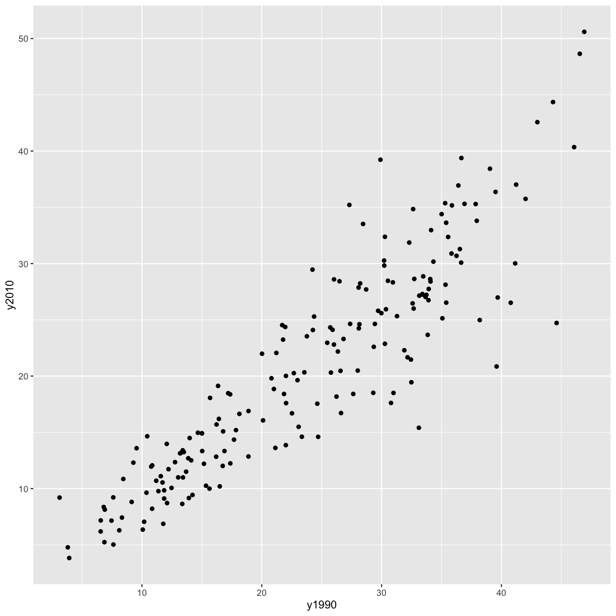
Alright, now we have a plot with the mean percent of smokers in in 1990 on the x axis and the mean percent of smokers in 2010 on the y axis, and each point represents a country. However, the different ranges on the x and y axis make it hard to compare the points. Let’s fix that by adding a line at y=x.
smoking_cancer %>%
  group_by(country, continent, year) %>%
  summarise(smoke_pct = mean(smoke_pct)) %>%
  pivot_wider(names_from = year, values_from = smoke_pct, names_prefix = 'y') %>%
  ggplot(aes(x = y1990, y = y2010)) +
  geom_point() +
  geom_abline(intercept = 0, slope = 1)
`summarise()` has grouped output by 'country', 'continent'. You can override
using the `.groups` argument.
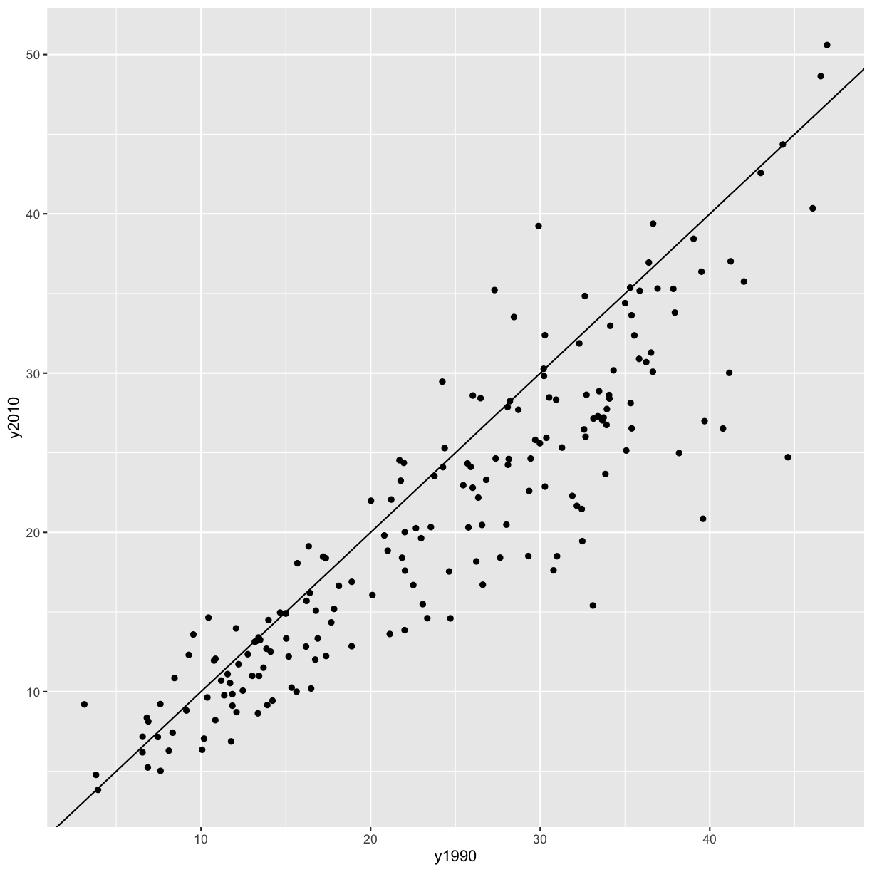
It seems like in most countries the percent of smokers has decreased from 1990 to 2010, since most of the points fall below the line y = x. However, there are some countries where smoking has increased (i.e. the points are above the line y = x). Let’s figure out which those are!
Bonus: Identifying countries with more smokers in 2010 than 1990
Use what you’ve learned from today to figure out which countries had higher smoking percentage in 2010 than 1990.
Bonus: Order the data frame from greatest to smallest difference. HINT: The
arrange()function can help you do this.Solution
smoking_cancer %>%
  group_by(country, continent, year) %>% # group by the columns you want to keep
  summarise(smoke_pct = mean(smoke_pct)) %>% # summarise to get one value per country per year
  pivot_wider(names_from = year, values_from = smoke_pct, names_prefix = 'y') %>% # pivot wider
  mutate(diff = y2010 - y1990) %>% # find the difference between the years of interest
  select(country, continent, diff) %>% # select the columns of interest
  filter(diff > 0) %>% # filter to ones where the difference is greater than zero
  arrange(-diff) # bonus - arrange by diff, highest to lowest
`summarise()` has grouped output by 'country', 'continent'. You can override using the `.groups` argument.# A tibble: 42 × 3 # Groups: country, continent [42] country continent diff <chr> <chr> <dbl> 1 Bosnia and Herzegovina Europe 9.33 2 Lebanon Asia 7.91 3 Afghanistan Asia 6.08 4 Albania Europe 5.23 5 Indonesia Asia 5.07 6 Saudi Arabia Asia 4.21 7 Uzbekistan Asia 4.04 8 Kiribati Oceania 3.68 9 Mali Africa 3.03 10 Djibouti Africa 2.83 # ℹ 32 more rows
Additional practice
Let’s go back to the very first question we talked about today: Is there a relationship between population and ambient pollution levels (in micrograms per cubic meter)? In addition to making a scatterplot, another way to get at this question is by calculating a correlation coefficient. We will cover two correlation coefficients here: Pearson’s (which assumes a linear relationship) and Spearman’s (which doesn’t assume a linear relationship).
There is a function in base R that calculates correlation coefficients (cor()), but is kind of hard to use with the tidy way that we’re used to doing things. So we’re going to download another package that’s part of the tidyverse, but not the core set of packages that we downloaded originally, called corrr (that’s not a typo - there are actually 3 r’s at the end). This package has a function called correlate() that makes it easy to find correlations between variables.
Take the following steps to calculate the Pearson and Spearman correlations between population and ambient pollution levels:
- Install and load the
corrrpackage. - Subset
smoking_pollutionto the population and ambient pollution level columns. - Find the Pearson correlation between smoking and pollution using the
correlate()function from thecorrrpackage. - Find the Spearman correlation between smoking and pollution using the
correlate()function from thecorrrpackage.
Solution
# install.packages('corrr') # only run this once
library(corrr)
Error in library(corrr): there is no package called 'corrr'smoking_pollution %>% select(pop, pollution) %>% correlate(method = 'pearson')Error in correlate(., method = "pearson"): could not find function "correlate"smoking_pollution %>% select(pop, pollution) %>% correlate(method = 'spearman')Error in correlate(., method = "spearman"): could not find function "correlate"
Additional practice
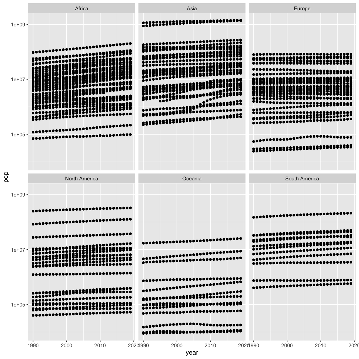
Remember that we made a scatter plot of year vs. population, separated into a plot for each continent, and that it had 2 outliers:
library(tidyverse)
smoking <- read_csv('data/smoking_cancer.csv')

smoking %>%
  ggplot(aes(x=year,y=pop)) +
  geom_point() +
  facet_wrap(vars(continent))
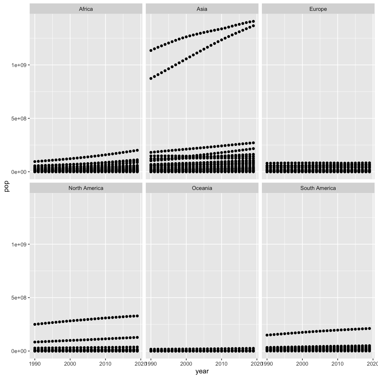
Write some code to figure out which countries these are (even if you already know!).
Solution
smoking %>% filter(pop > 5e8) %>% select(country) %>% distinct()# A tibble: 2 × 1 country <chr> 1 China 2 IndiaHere we used the
distinct()function, which we first saw yesterday. This function is not required to find the answer to this question, but it helps us get the answer a bit more quickly.
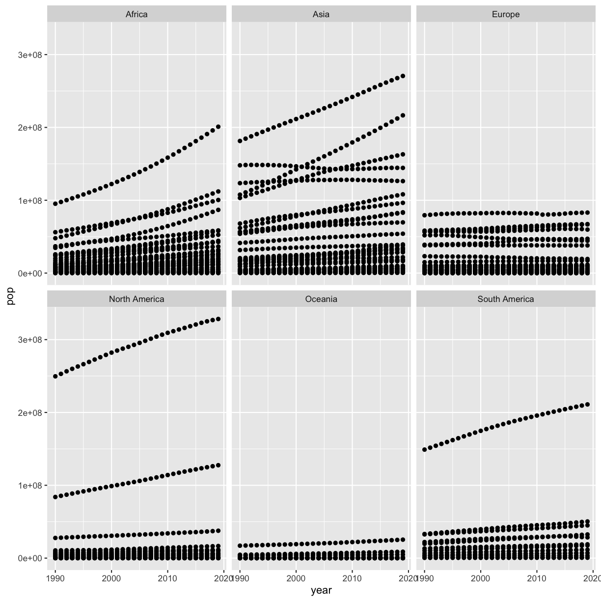
Next, plot year vs. population separated into a plot for each continent but excluding the 2 outlier countries. Note that usually you don’t want to exclude certain data points from a plot because it is misleading (see Bonus 2 for an alternative).
Solution
smoking %>%
filter(country != 'China') %>%
filter(country != 'India') %>%
ggplot(aes(x=year,y=pop)) +
geom_point() +
facet_wrap(vars(continent))
Another solution is to use only one filter command and separate the two true/false statements with an ampersand (
&) or comma (,), which means that you want to exclude both China and India:smoking %>% filter(country != 'China' & country != 'India') %>% ggplot(aes(x=year,y=pop)) + geom_point() + facet_wrap(vars(continent))

Bonus 1: Instead of hard-coding the two countries to remove them, remove the two outliers by combining your solutions to the first two questions.
Solution
smoking %>%
filter(pop < 5e8) %>%
ggplot(aes(x=year,y=pop)) +
geom_point() +
facet_wrap(vars(continent))
Bonus 2: How can you make the differences between countries more visible on the plot without excluding the two countries you identified above?
Solution
You can scale the y axis using a log10 scale to make the differences more visible:
smoking %>%
ggplot(aes(x=year,y=pop)) +
geom_point() +
scale_y_log10() +
facet_wrap(vars(continent))
Applying it to your own data
Continue working on your project. Now you can generate some summary statistics as well!
Key Points
Package loading is an important first step in preparing an R environment.
There are many useful functions in the
tidyversepackages that can aid in data analysis.